

TypeTalk: The Work of Creative Contrarian Art Chantry

Photo by Ras Rasmussen.
The gritty work of Art Chantry speaks for itself. But that doesn’t mean this opinionated contrarian doesn’t have anything to say—quite the opposite! This master of low-tech design is known for his gig posters, album covers, magazine design, and logos. His work is most often associated with the ’80s underground grunge movement that was born in his Seattle hometown. In fact, he has been referred to as “Seattle’s unofficial granddaddy of grunge.”
Quirky, sometimes shocking, and occasionally disturbing, Chantry’s work is not just a visual statement of non-conformity and rebellion, but is a unique and honest expression of the times. His low-tech, low-budget aesthetic began during the punk rock era, and later turned him into a mainstream, influential pioneer. But when you look past the surface, you will see a framework of traditional composition and design principles.
Art Chantry’s work can be viewed as a social, political and cultural design commentary. In fact, this visual iconoclast has described his work as “on the fringes of acceptable society.” It represents a moment in time that became a movement and which now occupies a unique place in design history. Not only is his design style non-conforming and defiant, but so is his methodology. His process was originally the product of his pre-computer, low-budget clients, but eventually became his trademark style and one that he still practices. He replaces computers (for the most part) and their creative limitations with found type, deconstructed images, and other low budget yet highly inventive techniques.
We asked Chantry to speak about his work and methodology, which he happily did, including fascinating back-stories and explanations of his unconventional production methods.
When did you get interested in typography (and design)?
The earliest work I was ever hired to do was little clever word drawings for friends in high school. As I recall, hand-drawn lettering was all I did in the earliest stages of my career. Eventually, I started to include imagery (found or created) and the larger design interest emerged from that.
I view typography as construction. I BUILD type forms. I’m not a calligrapher, but when I use calligraphy, it’s not drawn with a writing tool (like a pen), but literally constructed as built letterforms that just happen to echo calligraphy in visual form. It’s a trick. As a kid, I collected comic books. I built monster model kits. I watched a lot of pop television. That is where I was initially exposed to typography. The idea of “fine” typography is something I was exposed to decades later as a student. Then I just gravitated toward that look because it was what I was told was “good.” But as I got older and wiser, I walked away from what academia told me was acceptable, and just did what my clients wanted.
I no longer consider myself a typographer. Computers changed the rules so much that everybody could do adequate typography with little or even no training, so I stepped back in time to building letterforms by hand with found materials and imagery. I enjoy saying I no longer “do” typography, I do LETTERIN’!
Who or what were the major influences in your work? How did the politics of the 60s/70s influence your style?
Like I mentioned earlier, comic books were a huge influence—television, pop culture, etc. I was exposed to the monster type of Harry Chester when I subscribed to Famous Monsters of Filmland. I was exposed to Cal Schenkel’s thinking by finding an ad for The Mothers of Invention in a Strange Tales comic book. I was introduced to endless possibilities by the world of rock and roll visuals: posters, record covers, performances, etc. I was taught how to make important announcements typographically by watching the pioneering work of William Golden, Lou Dorfsman and Herb Lubalin on the CBS Evening News every night. The culture around me taught me EVERYTHING. Academia only taught me how to survive a system that was trying to destroy me. But I grew up during the Vietnam era—I actually knew all about having to survive in a world out to get me.
The guys in this band were into their “bachelor pad” period where they dressed in natty smoking jackets and dapper spats and smoked cigars and drank expensive bourbon. So, I went with an echo of the Saul Bass “Man with the Golden Arm” era of his movie title graphics for this 1995 CD cover. Lots of bold pointless crap (like arrows that don’t point anywhere) and snappy lettering that looks stuck in the past. All the lettering is hand rendered and photocopied many times over.

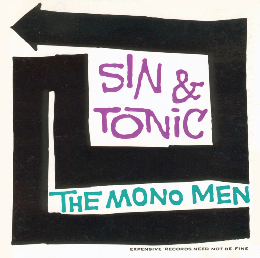
The type in this 1998 concert poster is a re-creation of some lettering used on one of their old record covers from the early 1960s. The whole thing is an attempt to re-establish this style to include the work associated with the last great era of northwest rock (the early 60s) with the grunge scene in Seattle. It worked. Before long there were dozens of other gig poster artists working in this style. Now it’s part of the dialog again.
How do you decide whether to use fonts, found type, or other methods, such as collage or hand lettering?
Those decisions are made by the spirit and personality and thinking of the client and their needs (not necessarily their demands). The one thing I’ve learned to shove into my typographic treatments is PERSONALITY. That personality can be anything you want, but I try my hardest to insert the spirit, the personality of that project. Today we call this branding, but that’s just a bogus word to refer to marketing practices that are as old as mankind. The bottom line is I have to get the client’s requirements across to the audience. I use the magic at my disposal to manipulate that viewer into changing their mind about something. It’s my job to use the language of graphic design to talk that viewer into “buying this product,” “attending this event,” or “voting for this candidate.” We’re quite dangerous in our actions, really. There is great power in our skills.

This 1983 poster was for a performance of Macbeth set in the time of the old west cattle barons. I used a photo of my grandfather that had been partially burned. I selected vintage Victorian wood typefaces for the main title, then placed the title into a bloodstain that covers the burned area of the photo. The typography across the top (set in good old Helvetica, because it’s so boring and non-competitive that it clashes with NOTHING you place near it) was on every poster for the entire season, and acted as a branding identifier for the outfit.

This 1986 poster was a case of “design by committee.” After meeting with them several times, I told them that I would use ALL of their ideas—and I did! I would have tossed a kitchen sink in as well if I could have found an image of one. All the typography was either set by a typesetter for me or (the larger type) was cut out and pasted letter by letter by hand. All the type was inspired by some Dutch postage stamps I saw years earlier that were designed by Jan van Toorn. Give Peace A Dance was a 24-hour dance marathon to raise funds for peace causes.
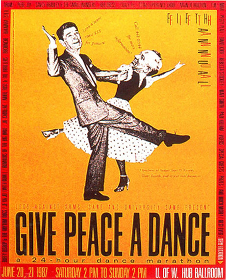
1987 was when the INF peace treaty was being negotiated (a nuke reduction treaty) between Reagan and Gorbachev, so I had them dancing in celebration. The typography was set using phototype processes. It’s a lot of copy, so I fit it all into a border treatment. The headline type was the same as last year’s poster, and thus become a logo through repetition. Some last minute info was added in an italicized “word balloon” style from the mouths of the babes.
What is your typical (creative and production) process? Do you do any work on a computer these days?
Yes, I have to use computers these days. The entire paradigm has shifted to the point where no printer will accept work on anything but digital format. Prior to computers, my art form was the mechanical, the paste-up. I used it to “talk” directly to printing presses. So, I still try to create as much of a mechanical as I can, then scan it and have it assembled. It means “dumbing down” what I do a great deal. Not being able to work full size on a poster design is dreadful and limiting and just plain inexcusable. But, it is the way it is. I have to work small enough to fit it onto a scanner. See my point? It’s lame.
Most of my design process happens inside my head nowadays. I usually know exactly what to do long before I sit down and do it. Most of the time is spent trying to figure out how to show it to a client who is completely spoiled rotten by being able to see a complete printed finish of an idea before he even has to do anything. I demand collaboration with a client, while they are used to picking things off the shelf ready to buy. I present process, they expect product. So, my work process befuddles a lot of clients. That’s okay. It helps to cut the wheat from the chaff.
Basically, I think about it, then eventually sit down and create the idea. I choose my best idea and my only decent idea (all subsequent ideas are steps back rather than forward). The actual “board” or production time I spend on a design is usually around half an hour. That’s because I spend a month designing it in my head and 50 years prior learning how to do that. Then I have to sell it to the client. I hate sales work. I end up letting the work explain itself. If they don’t understand it, okay, I’ll try to explain a few times. Eventually they make a decision. Not much of a design process to entertain people any more. It’s all about human interaction and being able to talk with adults about adult subjects. I can articulate ideas. It took me 40 years to learn how to do that.
What was your favorite project?
Well, if you consider branding an entire cultural moment, I’d say that GRUNGE was really a special moment when I saw that happen. Not many people can make a claim like that. I actually can.
However, my favorite project over the years was the work I did for Estrus records (founded by Dave Crider). When you have a great collaborator for a client, you do everything you can to hold onto them and maybe you’ll get to create a body of work for that client that is as special and good as the work Dave and I did for that little record label. There is no reason on earth why that (basically) one-man record label should ever have looked like it did—the graphics were trendsetting and sparked a lot of subcultural history. But then, I’ve done the same with other projects as well (Sub Pop Records, The Rocket, Urban Outfitters, Coca).

The cover of a catalog/zine/newsletter issued by Estrus Records to promote their artists and releases. This issue from 1995 was a parody of the old Famous Monsters of Filmland magazine design by art director Harry Chester. All the lettering was drawn by hand to recreate the look and style of their covers of the 1960s, where Chester created the greatest monster type of all time. My effort is merely a weak homage to his work. Illustration by Alex Wald.
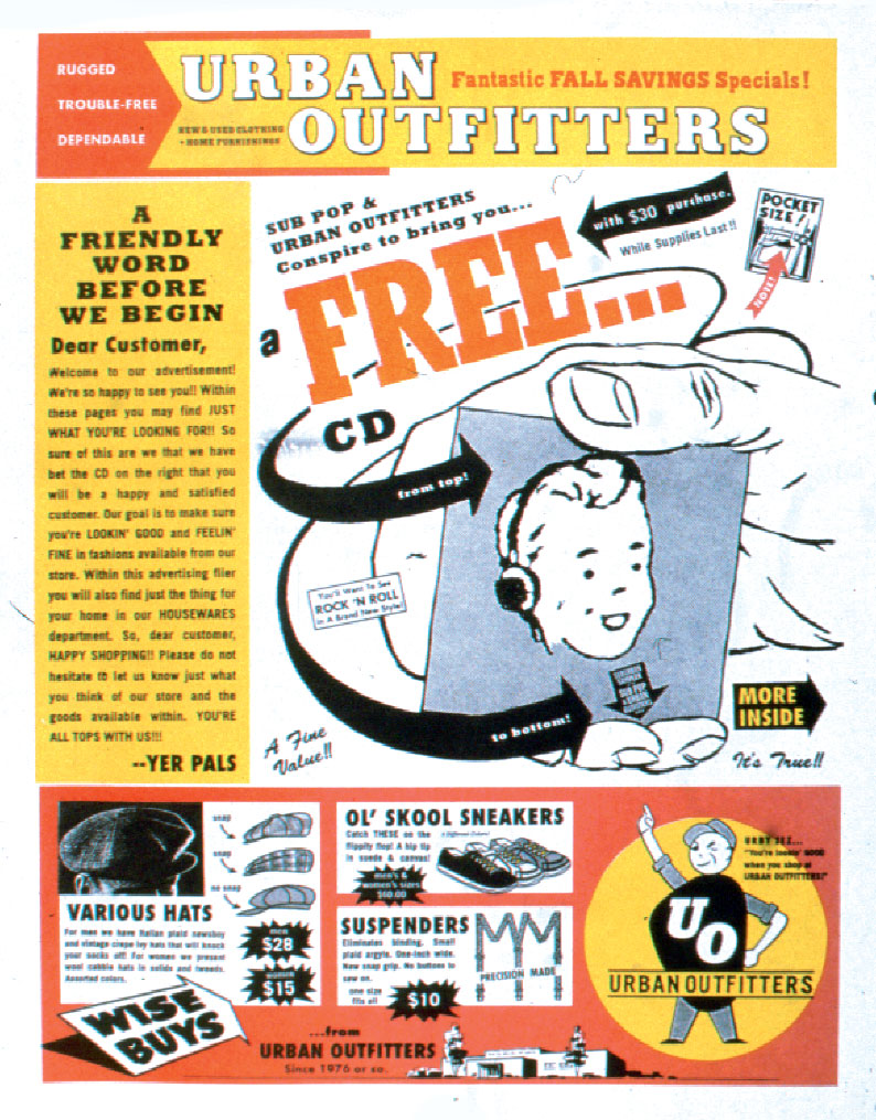
The clothing store Urban Outfitters wanted to jump on the grunge bandwagon, so in 1995 they hired me to use all the styles and attitude I had developed and apply them to their corporate identity. We based everything on old industrial advertising from the 1940s and ’50s. From that point on, this look became their brand identity. It was all our playing around with old-fashioned BAD design. One of the tricks I used was to mix two typefaces together that looked remarkably alike to the untrained eye, but were totally different—Futura and Franklin Gothic. I would have all the copy set in both typefaces, then I would cut then apart and paste the two typefaces together randomly. The result would create a subtle clunky visual clash that even the designers couldn’t figure out. That weird “clunk buzz” of the clashing type echoed the old letterpress impact of the lead type. It was a way to create the LOOK of letterpress without physically being able to actually DO that physical impact of letterpress. Pretty clever, eh? They are still using this style as their brand all these years later. So are several other competitor companies. There were lawsuits where this work was used as evidence of the styles these companies were trying to patent as THEIR style. So, it really worked perfectly and they were ALL ripping me off, not ripping each other off. Hilarious.

The Coca Cabana was a temporary nightclub set up by the Seattle arts organization COCA (Center On Contemporary Art) where the performers were replaced by performance artists. Because artists didn’t know a thing about typography in 1987 (particularly before the advent of computers), I tried to make incompetent typography like an artist would make when executing a poster. I used a plunger bottle cap from a Pelikan ink bottle as I wrote out the words—I would randomly squeeze the bladder, and the ink would rush out at inappropriate moments. It created an almost illegible blobby calligraphic look that captured the chaos for the performances and the spontaneity of the moment.
…and your most unusual or challenging one?
Good lord, most of my corporate clients are the most challenging, not because the work is complicated or difficult, but because the corporate culture is so utterly awful and unable to make decisions. So, challenging would be surviving a corporate client intact.
Most unusual? Have you seen my projects, my clients? It’s ALL unusual. Downright strange. You want to do unusual work, then you work with unusual clients.
What advice would you give aspiring designers?
Work outside the box—literally! Do everything you can to end your complete dependence on your computer. Read books. Look around, figure out where it all came from and how it began. Learn to understand the world.
Any final last words?
Carry a gun.

A 1986 trade science fiction paperback book cover about a young boy who got stuck in a time loop during WW2. I made a vortex of period confusions and the young boy attempting escape. The type (Futura Medium Inline) was selected because of its precise and hard geometry combined with the inline provided extreme legibility against any texture. Thus, I had a title that could be placed on top of chaos and still read perfectly at a glance.

This is the back of a 7″ EP issued by C/Z Records in 1987. The type was originally set on a phototypesetter, then photocopied 20 times. I even left in the cut lines (does anybody know what those are any more?). The most interesting part was the fact that this is the very first record that Nirvana was ever released on. When it came time to properly spell Kurt Cobain’s name, Daniel (the label owner) and myself didn’t know how to spell it (we both knew another “Kurdt” who lived in Aberdeen and played in rock bands, too). We tried to call Kurt up and even call other people who knew him, but nobody could afford telephones back then. So, we decided to misspell it as badly as we could, just because his name would be funny. That seems to have been the start of Kurt’s infamous misspelling of his name on later records—a bad joke gone even worse.

A quick handbill/poster that acted as an ad and as a ticket to attend this 1993 record release concert. All the lettering was photocopied from a fax or lettered by an eight-year-old child. I had a kid write the alphabet for me several times and used that as my typeface.

This 1994 poster was for a rock performance where the promoters would give a discount to anybody who showed up in their pajamas—it was a PAJAMA PARTY!!! The illustration was an early piece by Ed Fotheringham. The type was all done with press type I had laying around. That’s why the typefaces change so much—I would run out of type on one sheet and had to switch to another. The headline type was found in an ancient old Mexican type catalog—terrible lettering stuff that looked delicious in places like this.

This was a production of Shakespeare re-set in a seemingly inappropriate period. This version was performed in the faux 1950s “Happy Days” era, so I created typography that recalled a drive-in movie marquee. For this poster designed in 1995, I was being asked to create a design without pictures or illustrations and just to let the word do everything (the client was scared of my imagery at this point). So I had to let the typography do all the talking for me. I did that with faded period styles.

I used a curly scriptface and placed it suggestively on the panties for this 1995 poster. Then I had flames coming up from inside the panties. When the name of the band is Flaming Lips, depicting anything else would be lying. The curved type on the stocking was done by moving the type on the surface of the photocopy machine while in progress. This technique is often referred to as “swishing.”

For this 1996 poster for Australian punk/noise band Noise Addict, I found an old “pre-disfigured” image of a baby that accidentally pointed at its ear. So I focused everything into the concept of shattering volume destroying a child’s hearing (just for laughs). All the lettering was done with a very old sheet of press type that had dried and would shatter when rubbed down. (Nothing else in the world looks like that.) After I crudely rubbed down the lettering, I photocopied it about 25 generations until it looked like this: shattered sounds and deafening noise.

The background texture of this 1996 album cover is a re-created pattern found on an old vintage plastic shower curtain. I rebuilt the entire pattern by hand using Amberlith overlays and color builds. We ran the pattern on the inside of the cover as well. The lettering was all cut freehand out of Amberlith, photostated, and then collaged together into what you see.

This 1996 CD cover is for a compilation of accordion music being released by Rhino records. To create the effect of an accordion, I pasted up the background type to flex and bend like an accordion being pulled open, and then put the finger boards on both ends. Then I used an accordion fold to echo the idea of the accordion. And best of all, you could play your CD cover along with the music!

All the type for this 1997 poster was either filtered and altered from existing vintage trash cinema advertising, or I drew it by hand. If you know anything about The Cramps, you’d understand the idea and the aesthetic of this poster.

This 1997 ad is for a play about S&M relationships. The red bands suggest bondage. The text was dumped in the second leg of the “N”. That little piece of type referring to “Printer’s Devil Theater” is the theater company’s logo.

Because they were from Opelika, Alabama, this band wanted this 1998 poster to tie in with the swamp monsters and black panthers of legend in the Delta swamps. So I used a well-known image that was used by the notorious Black Panther party of that time on a few of their flyers (I though that would be a fine joke). The information simply became the whiskers onto the panther’s face. All the type was photocopied out of catalogs and glued into place letter by letter to create the perfect curves.

All the lettering on this 2004 poster was done by photocopying pages from old type catalogs and then (literally) cutting out each letterform with an X-acto knife and pasting them down letter by letter. It’s a technique that looks like nothing else (especially for curving or dancing type) that I’ve used for 40 years. I then re-copy it to size and paste in the photocopy.

A 2012 theater poster for a low-budget performance by a struggling theater company. I was doing a series of super low-budget posters for this group that involved spending almost no money. Even the printing was super cheap done on a newspaper web press. The image is an infamous old protest poster image from the 1960s. All the lettering was done with chunks and bits and pieces of photocopied text type. The New City Theater lettering had become their ad hoc logo design. The crooked section at the bottom started out as an accident and was carefully fixed into place to capture the chaotic nature of the production.
Read and see more of Art Chantry’s work and opinions in these books:
Some People Can’t Surf: The Graphic Design of Art Chantry, by Julie Lasky and Karrie Jacobs and designed by Art Chantry
Art Chantry Speaks: A Heretic’s History of 20th Century Graphic Design