

The Digital Art Studio: Rescuing Old Photos #1

As the representative digital professional in my family, I’m frequently tapped to rescue an aging photo. Although occasionally a photo is worthy of me devoting a professional level of retouching attention, in most cases the request is simply, “if it doesn’t take too long, can you do something so I can see it again?”
Especially with Photoshop tools being constantly improved and updated, there are limitless approaches that you can take to “fix” photos. While the perfect restoration may still be time-consuming, this mini-series focuses on a few of my quicker fixes to recapture most of the life hidden within aging family snapshots. In the same way that “over cleaning” a Renaissance painting can drain all the life out of a classic, over the years I’ve found that in many cases it’s best to partially restore a photo, rather than attempt to make it appear entirely new again. By leaving just a little of the aging process in place, it’s possible to rescue the contents and details in a photo, without relinquishing its nostalgic impact. This means that the goal is often to “rescue” the life of a photo, and not to completely restore an image to its original state.
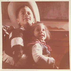
On my last visit to my mother, amongst the photos pinned to her kitchen wall was this long-faded giddy-up snap up of little me and my big brother Arthur. Yep, Westerns were a big thing in the 60’s, and I sure loved those duds. The years had faded this early-era full-color photo into almost sepia tones. There are many things to try within Levels to fix images, but in this case, just applying the three White/Black/Grey Point adjustments within Levels restored most of the color and detail. While all three adjustments can be combined within one Levels adjustment layer, by keeping each on its own Adjustment Layer it’s simple to isolate (and tweak) each of the shifts separately.

My mom didn’t want to part with this last photo record of our cowhand days, so instead of transporting it 3000 miles round-trip to scan it properly, I merely steadied and squared off my iPhone and snapped a decent shot and then brought the snap into Photoshop.
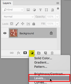
Of the many ways to make adjustments, I generally prefer to start with Levels from the Adjustment Layer pop-up in Layers panel. By always applying adjustments as an Adjustment Layer, the photo all the adjustments are able to be continually adjusted and removed.
With a Levels adjustment, before doing anything else, I usually just quickly click Auto to see if it miraculously does the trick. In this case Auto was fairly useless, so I applied Undo to begin again with no adjustment.

Next, choosing on the White Point icon from the Levels panel, I moved the white point cursor into the image in search of the ideal white spot. In my image, the original framed edge of the photo should have been white, so I clicked that frame edge with the White Point cursor. You can try to click in different spots around your image to see how adjusting the image based on various white points affects your image.


With the white point is set, I needed to adjust the Black Point. To keep this adjustment separate from the white point, I added a new Levels adjustment layer. Choosing the Black Point icon I clicked in the darkest black point in my image to set that as the image’s new black point.

That helped a lot, but it still had a strong red cast. To remove most of the color cast of the faded image, I needed to find a spot in the image that should be a neutral grey tone. Making another Levels Adjustment Layer, I chose the Grey Point icon. Now this is going to take a few tries. You can always Undo, and if you’re unsure if you like an adjustment, you can make a new one, hide the previous Grey Point, and try another Grey Point area to sample. Clicking at one point in the image created a color cast that I felt was a bit too cool.
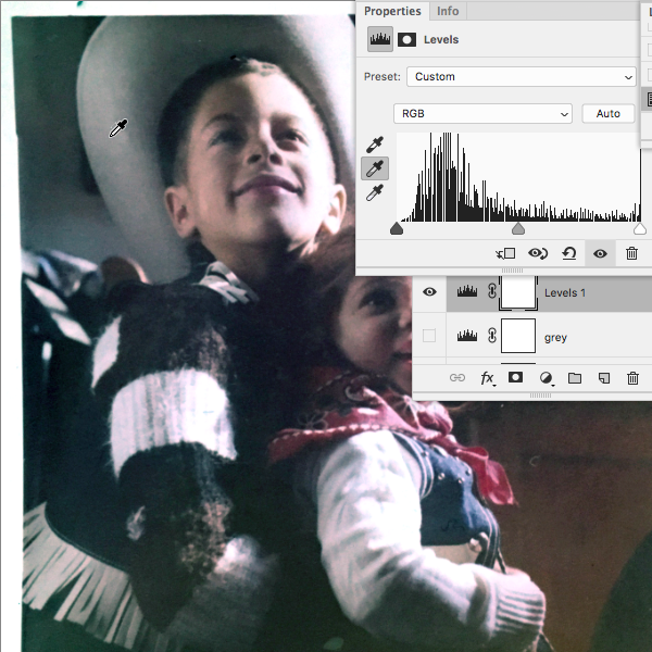
Clicking in another spot, still corrected most of the fading, but maintained the warm glow of the 60’s cowhand nostalgia.

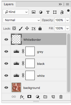
For a quicker but less flexible adjustment, once you understand what each of the adjustments do, you can apply all three within one Levels adjustment. However, it doesn’t take that much more time to keep each adjustment separate so you can maximize the options to tweak (or reduce the opacity) for each one individually without risking throwing off the other adjustments. Adding a layer on top, I used the rectangular selection tool to select a squared off version of the image, inverted the selection (Command-Shift-I/CTRL-Shift-I) to select border around the image, and held Command/CTRL while pressing the Delete to fill the white border around the image with the white background color to give the final version a clean edge.


very nice tutorial — I never thought about doing the white, black and neutral grey each on their own adjustment layer — simple and brilliant!
Thanks Donna! Glad you like. :)