

The Creative Toolbox: Usability by Design
|
The words “usability” and “Web” have been joined at the hip for some time. You can’t get too far into the discussion of a successful Web site without covering the merits of its usability. Good design should result in a highly usable product, but usability may not be foremost on your mind when designing for the Web. Whether you’re new to the concept of Web usability or an old pro, you may find yourself buildling better, more-frequented Web sites if you spend some time learning or reviewing usability basics.
Web usability is a big topic, to be sure, but the usability of a Web site’s navigation is especially crucial to its success. If users have a hard time navigating through a site then its design has failed before it has even had a chance to present itself. How long would you put up with a car with the gearshift in the back seat, or with a steering wheel that behaved differently when turned left than when turned right?
For this discussion we’ll focus on a few fundamental elements of navigation. Designing interactive elements to appear clickable, building feedback into interfaces, and giving users a sense of where they are can be effective ways to enhance a site’s usability.
Click Here
It may sound like common sense to design buttons to look like buttons, but many sites overlook this obvious rule. In fact, it’s one of the biggest problems plaguing the Web to this day.
An element on a page meant to be interacted with, whether it’s a button or hyperlink, should communicate this visually. Buttons should provide what usability experts call a “virtual affordance.” Just as a well-designed doorknob presents itself as something you place your hand on and turn — a natural affordance — a button should lend (or afford) itself to being clicked or interacted with in some fashion. This usually can be accomplished simply by adding some dimensionality to the button such as a bevel or an emboss effect, or by simply enclosing it within a color field or box outline. Formulate an interaction scheme and adhere closely to it. If all interactive (or hot) elements are colored red, carry this theme over to your buttons as well.
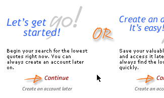
Visual clues such as the shadow effect above help indicate which elements are meant to be clicked.
Hyperlinks are the essence of the Web. Standard text hyperlinks have been around since the first browsers, and hence many surfers get the idea presented by a simple hyperlink faster than even the best-designed button.
Since the introduction of Cascading Style Sheets, omitting the underline emphasis of hyperlinks is becoming increasingly common. Many sites opt to color or bold a hyperlink instead of using the standard underline. If you want a highly usable hyperlink system, though, stick to the underlines. If you’re willing to take a marginal hit in usability for the sake of aesthetics, be sure to at least bold or color your links so they appear different enough from static text, and perhaps even reintroduce the underline in the mouse-over state.
Whatever the interaction scheme you devise, avoid using underlines as a form of text emphasis. Users have been trained to think of underlines as links. Using them in a different manner will only frustrate or confuse them.
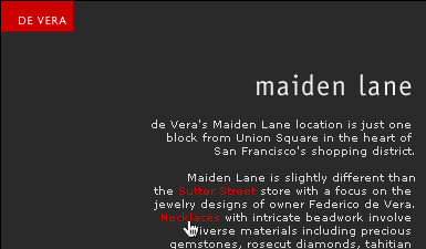
Although the designer decided to omit the underlines in this site’s links, they did create a strong interaction scheme. Interactive elements are in red.
 |