

Targeting Hue/Saturation Adjustments in Photoshop

Almost every image editing program has a basic hue/saturation dialog box with intuitive sliders for basic color correction, including Photoshop. For those new to image editing, Photoshop’s Hue/Saturation is easy to grasp; one slider changes the color, another slider affects the saturation, and a third makes the color lighter or darker. But newcomers also quickly learn that Hue/Saturation often affects far more of the image than they would like, at which point they start painting very complex (and often quite unnecessary) masks. And so an easy tool becomes laborious to use. Learning just a few simple, but almost hidden methods for controlling Hue/Saturation makes this tool useful for all users.
Which color is it?
After adding a Hue/Saturation Adjustment layer (using either the controls at the bottom of the Layers panel or the Adjustments panel), the first step to controlling what gets selected is to click on the disclosure triangle next to Master and choose a color range from the list.
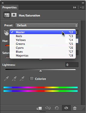
But which color do you want to change? If you have leaves in your photo, are they green or yellow? Is the sky blue, or is it really cyan? Fortunately, the Hue/Saturation dialog box makes it very easy to find out. You can guess the color, select that range, pick up the Eyedropper tool in the dialog box, and click on the color in the image. If it isn’t in the selected color range, Hue/Sat will automatically switch to the right color range. If a blue sky is really cyan, the Cyans range becomes active.
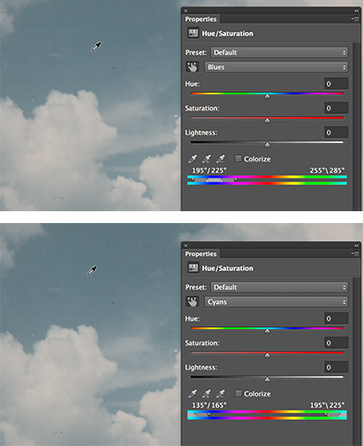
When Blues are really Cyans, Hue/Saturation will switch from Blues to Cyans when you click on the color in the image. If the Color Range bars appear at either end of the spectrum, you can hold down Cmd/Ctrl and drag the Color Range bars into the center (the cursor turns into a hand).
With the addition of the Targeted Adjustment Tool (TAT), selecting the range is even easier. When you open the Hue/Sat dialog box, click on the TAT icon (the pointing hand) if it isn’t already active. To keep it always active session to session, enable its Auto Select command from the panel menu. Now click on the color in the document that you want to alter. Hue/Sat will automatically select the appropriate color range.
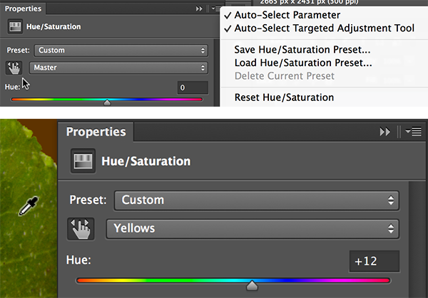
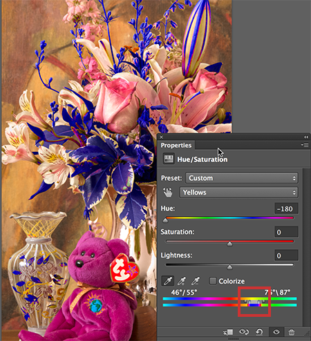
With the Targeted Adjustment Tool active, you don’t have to choose a color range—the TAT will select the right color range for you when you click on the color in the image—in this case, green leaves are really yellow.
Limiting the Color Range
Restricting Hue/Sat to one color range often still isn’t enough. With Yellows selected, everything within that entire range throughout the image will be affected. To restrict it even further, use the Color Range bars at the bottom of the dialog box. First drag the triangles and the bars very close together, but leave a tiny gap between them. Next, use the Eyedropper Tool in the dialog box to click on the desired color in the image. The range-limiting bars will probably jump to a new location. Move the Hue slider far to the left or right to “preview” the selection. By altering the color significantly, what’s selected is obvious.
Merely selecting a color range doesn’t necessarily limit the selection enough. Here creating a hue shift shows that most of the image falls somewhere within the Yellows range.

Begin by restricting the Yellows color range significantly, use the Eyedropper to select the color in the image that you plan to alter, then move the Hue slider far to the left or right to force the preview to display the selection in an obvious color.
To include more of the image than is currently selected, hold down the Shift key and click on another location. Usually this will cause the inner, fully selected portion of the color range bars to expand. If too much gets selected, hold down the Alt/Option key and click on the unwanted color to deselect it.
After adjusting the selection that falls between the vertical color bars, adjust the triangles on either side by dragging one or both closer to or further away from the vertical bars. This gap determines the range of selected color that will be partially selected. In order to avoid abrupt and often ugly color changes, you are now feathering the hidden “mask” you’ve been creating. You can sometimes drag the sliders quite close to the bars, but unless you’re looking for a special effect, be sure to allow for some fall off between a selected color and its neighbor.
Use the Eyedropper with the Shift key to add to the initial selection, or with the Alt/Option key to remove colors from the selection. Then move the color range bars and/or the feathering triangles on either side until the display shows the range of a color you want to adjust.
Making use of the hidden mask
Once you’ve adjusted the color range as precisely as you can, double-click on “Hue” to quickly reset the slider to its 0 position. Then adjust the Hue and Saturation sliders to alter the color. Be especially careful if you want to use the Lightness slider. Normally, I would advise against ever using this slider. Lightness is an blunt instrument that ligh
tens or darkens every tone in the image by an equal amount, usually causing harsh and unnatural results. Today we have numerous methods for adjusting an image’s tonal range that are both easy to use and far more sophisticated. But in this case you’re working with a greatly restricted portion of the image, so the Lightness slider can be useful. Zoom in to 100% when checking your color adjustments to make sure that none of the sliders is causing an overly abrupt shift between your adjustment and the neighboring colors. If the change flows smoothly, you’re good to go.

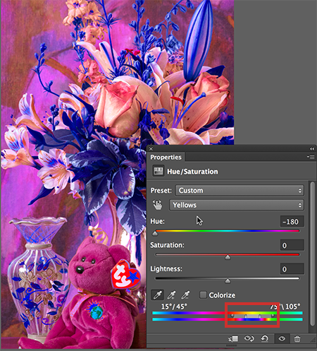
The original (left) and the adjusted image (right) after selecting the Yellows and the Reds for the bouquet, and then (on another layer) the very specific Red/Magenta of the bear. Only the tops of the center pink buds required using a hand-painted mask to avoid changing them along with the bear.
Hue/Saturation’s Cousin—Replace Color
If you like the way Hue/Saturation helps out in situations where a global color adjustment affects too much—and you’d like to avoid creating complex masks—you’ll also want to check out the Replace Color command (Image > Adjustments > Replace Color). Unfortunately, that command can only be used in a non-destructive manner by working on a copy of the image layer. It’s neither an editable Adjustment Layer nor a Smart Object Filter. But like Hue/Saturation, its Eyedropper automatically selects the appropriate color range, it offers a preview of the region selected, and it provides a Fuzziness slider to feather the extent of the range affected.

The bear is selected in Replace color using the eyedroppers and Localized Color Clusters to target specific reds, preventing the need for complex masking when altering the bear without also altering the pinks in the bouquet.
If Hue/Saturation would include Replace Color’s Localized Color Clusters feature, I think it would make Replace Color a relic of the past. However, when the color you’re targeting is in several discontiguous areas and you don’t want to include all of them, enabling Localized Clusters in Replace Color can come in handy. Try them both—I think you’ll find once you’ve reined in Hue/Sat’s tendency to affect too much of your image, there are plenty of reasons to use either it or its cousin, Replace Color.
[…] Even More Information (1) https://creativepro.com/targeting-huesaturation-adjustments-photoshop/ […]
very useful article
What about the latest version of photoshop? Does it apply the same way?
Yes