Since I announced my retirement from Scanning Around With Gene last week, the kind and thoughtful comments from readers have overwhelmed me and I want to thank everyone who chimed in online and those who sent me personal emails. Sometimes over the years I wondered if anyone was actually reading my efforts and it’s tremendously gratifying to discover that at least some of the topics made an impression. It makes all the late nights and early mornings (I do have a day job after all) more than worthwhile. Thanks again.
For my last column I wanted to keep things light and upbeat, so I decided to simply pore through all the old installments and grab a few images that caught my eye for whatever reason. Unfortunately this resulted in a collection of over 200 scans, so I’ve had to make drastic cuts to narrow things down to a reasonable amount, but this is still my longest column ever, so please be patient.
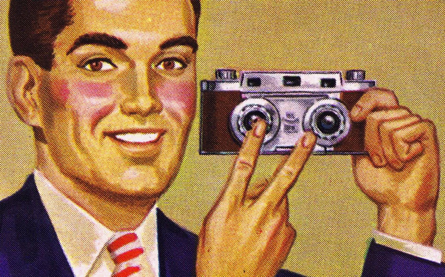
In reviewing my past columns I discovered a couple of themes, so I’m grouping images together that way, even though they may not have had anything to do with each other when they originally ran. But I had to start somewhere. First up, are a couple of classic icons I wrote about, the Happy Face and Peace Sign. Click on any image for a larger version.


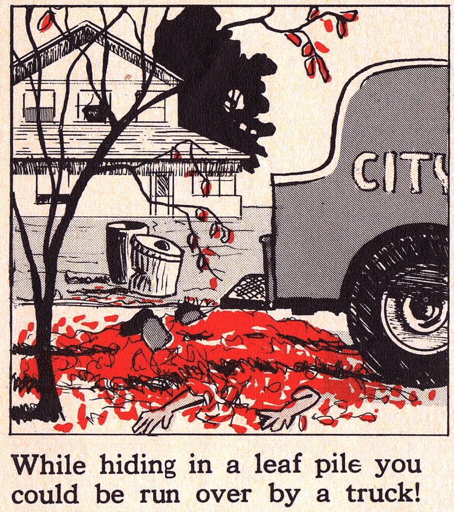
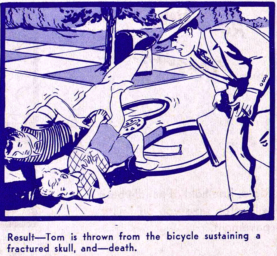
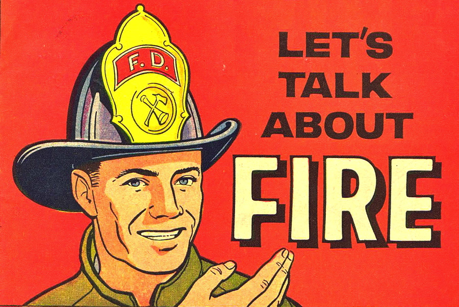
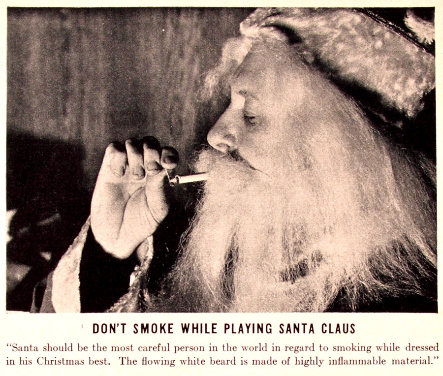
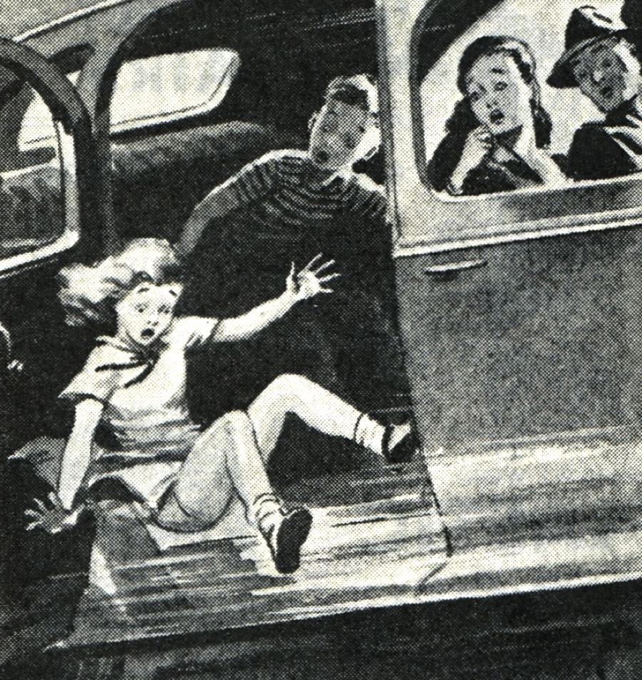
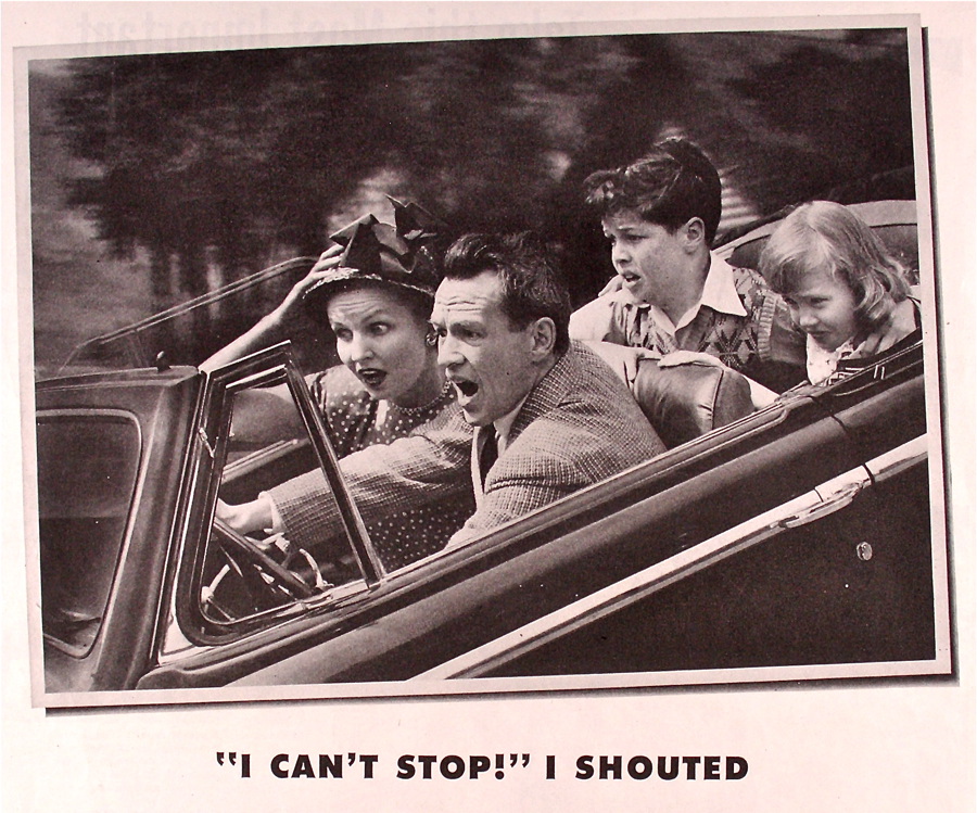
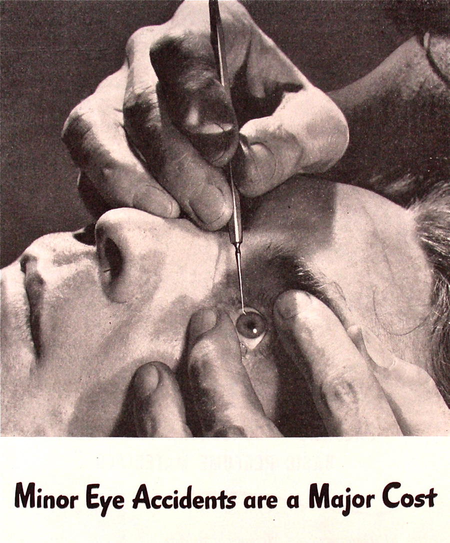
I think I covered the general topic of safety more than any other – many of my favorite images come from various safety pamphlets, bicycle safety guides, fire-safety brochures and insurance-company propaganda.
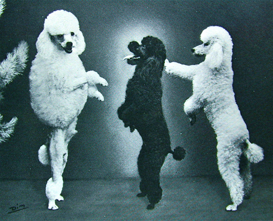
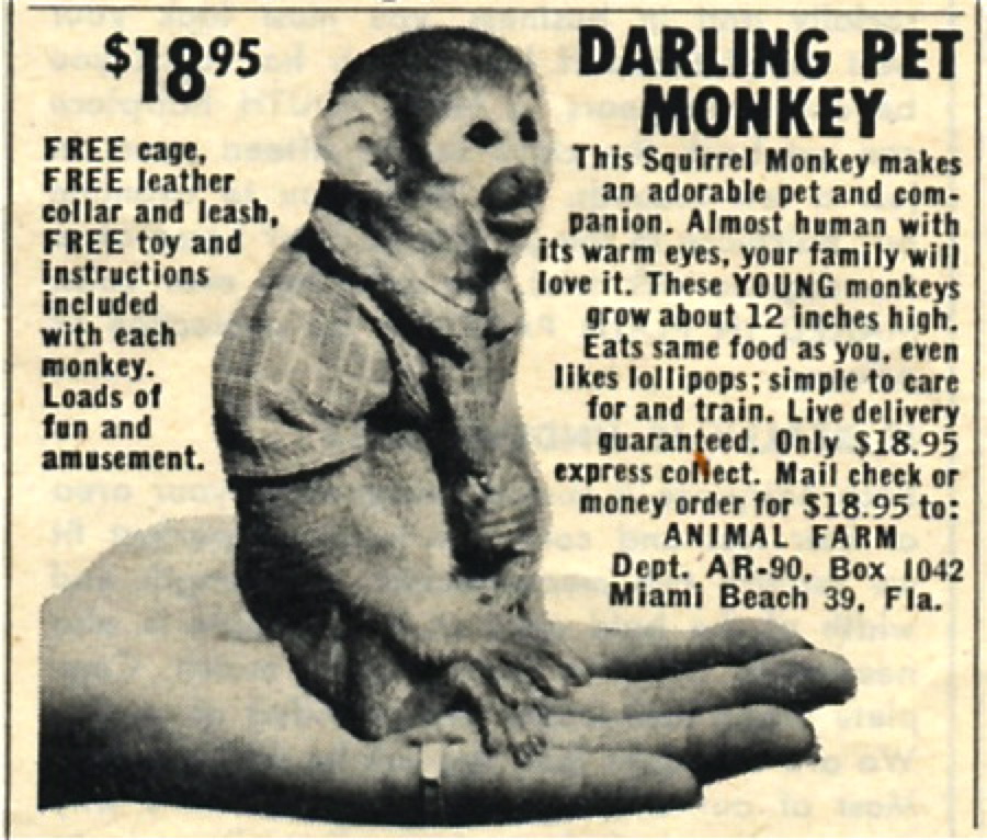
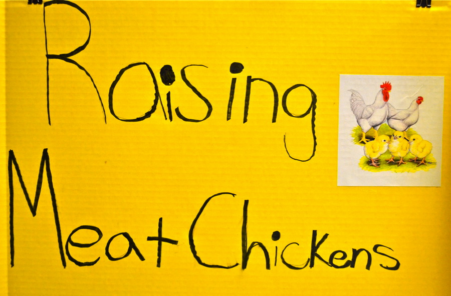
Animals appeared many times throughout the years, whether in columns about dog costumes, poodles or mail-order pets.

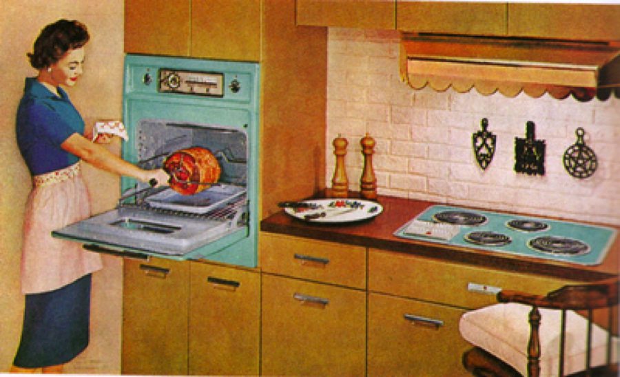
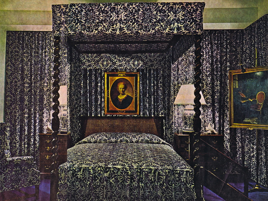
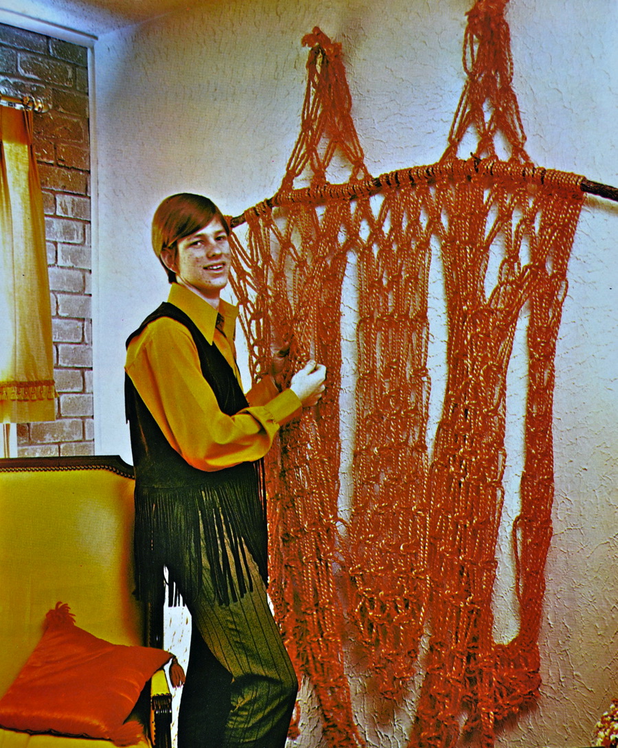
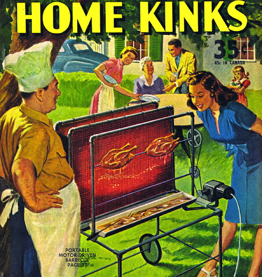
I’m a sucker for bad interior design, and throughout the years I covered kitchens, shag carpeting, macramé and many other topics that wouldn’t quite cut it in today’s homes.

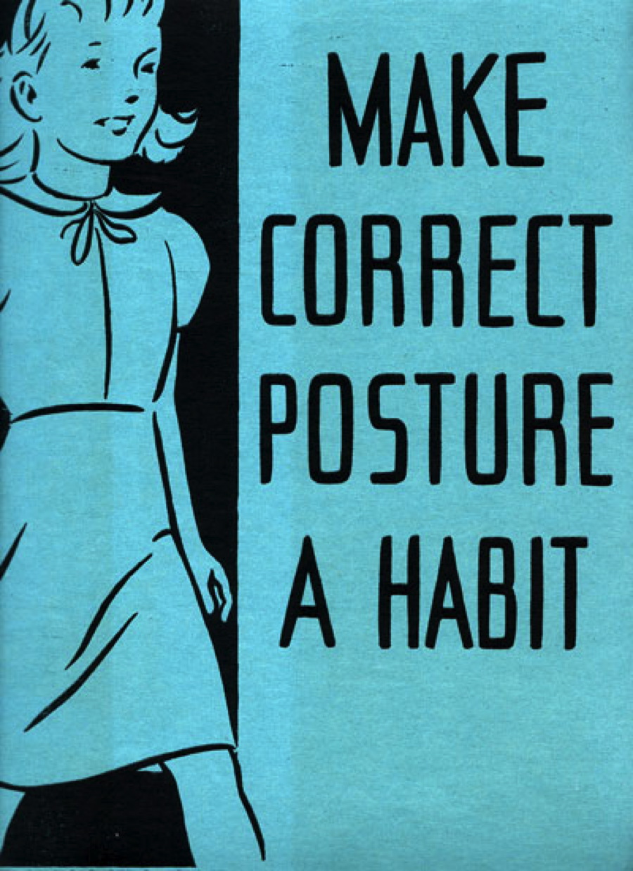
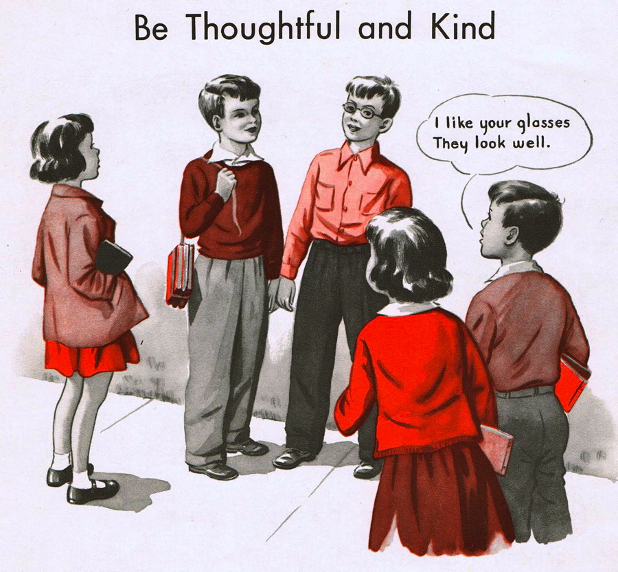
I love educational and propaganda material and many examples have populated various columns.

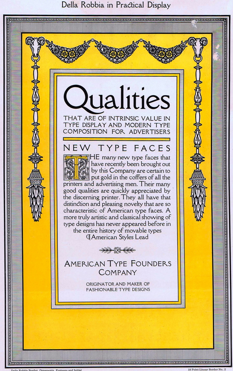
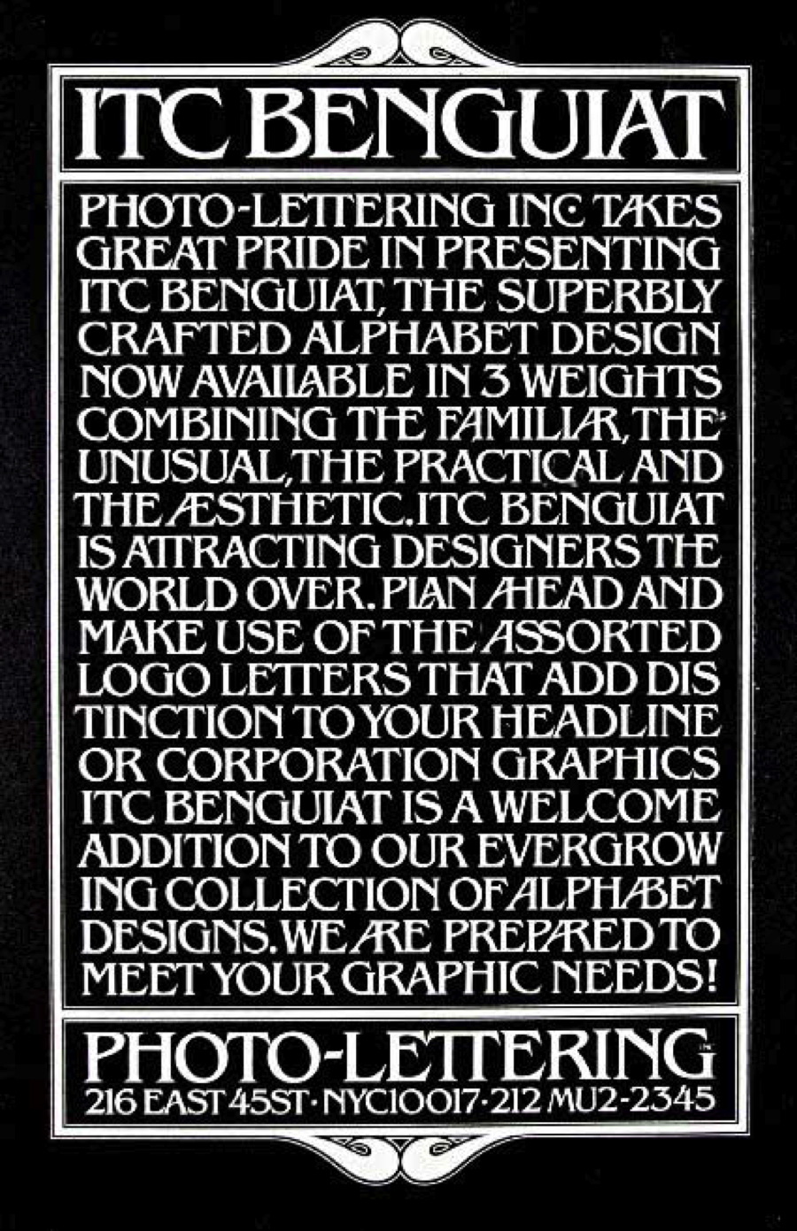
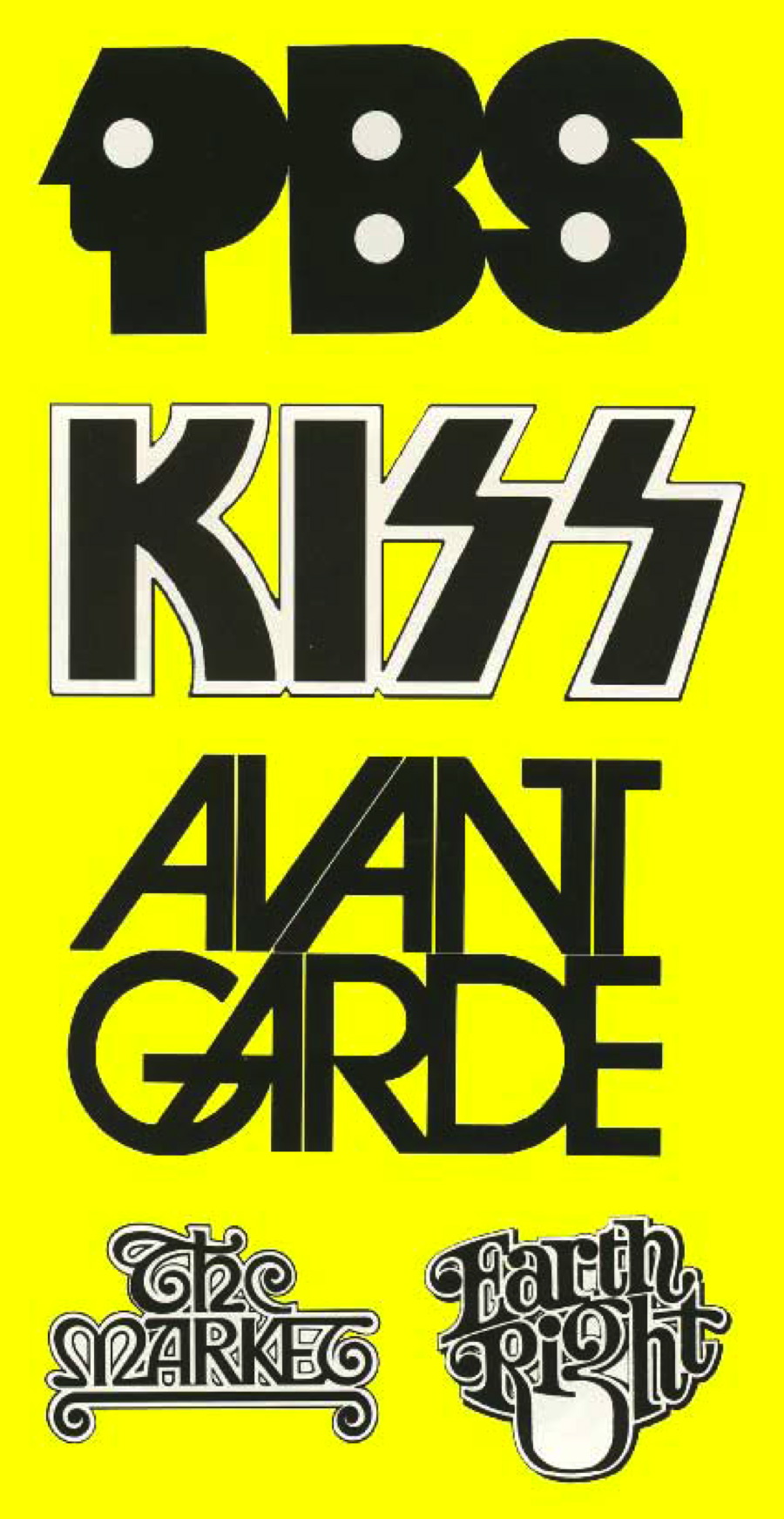
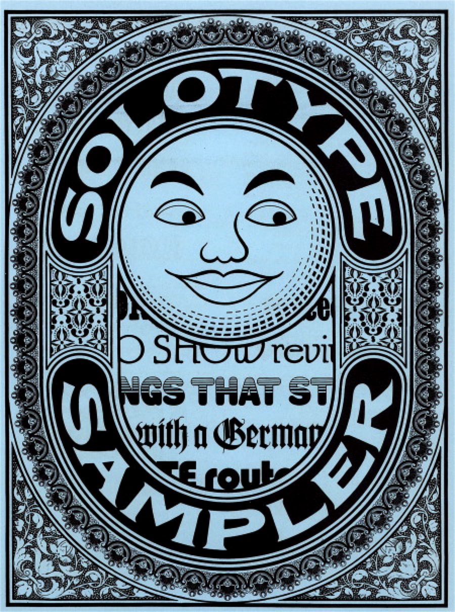
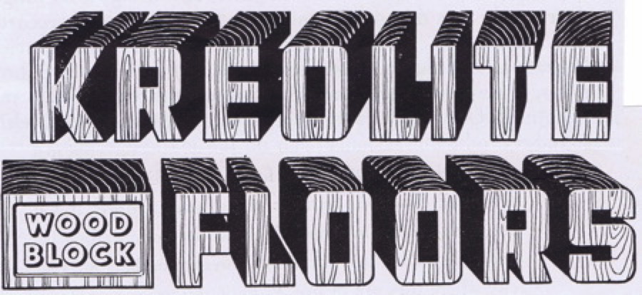
Over the years I’ve done my best to write about fine typography, typographic trends, and even individual typographers, but I must admit my favorite images tend toward the typographic unusual or decorative type.

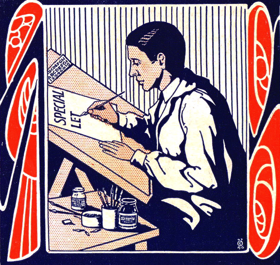
And I love hand-lettering as an art form, so I’ve covered that, as well.

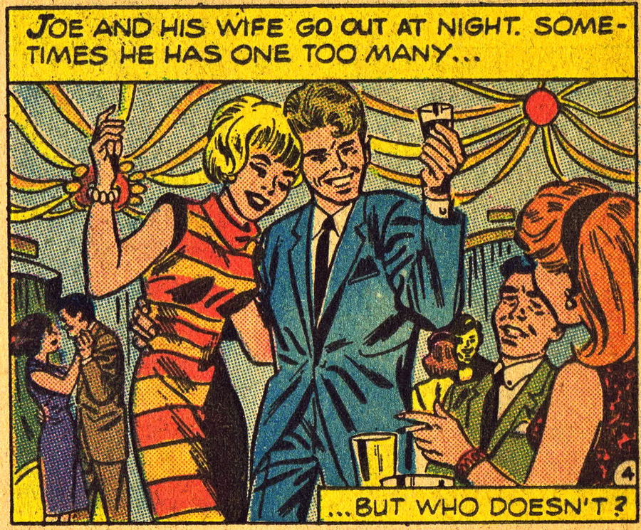
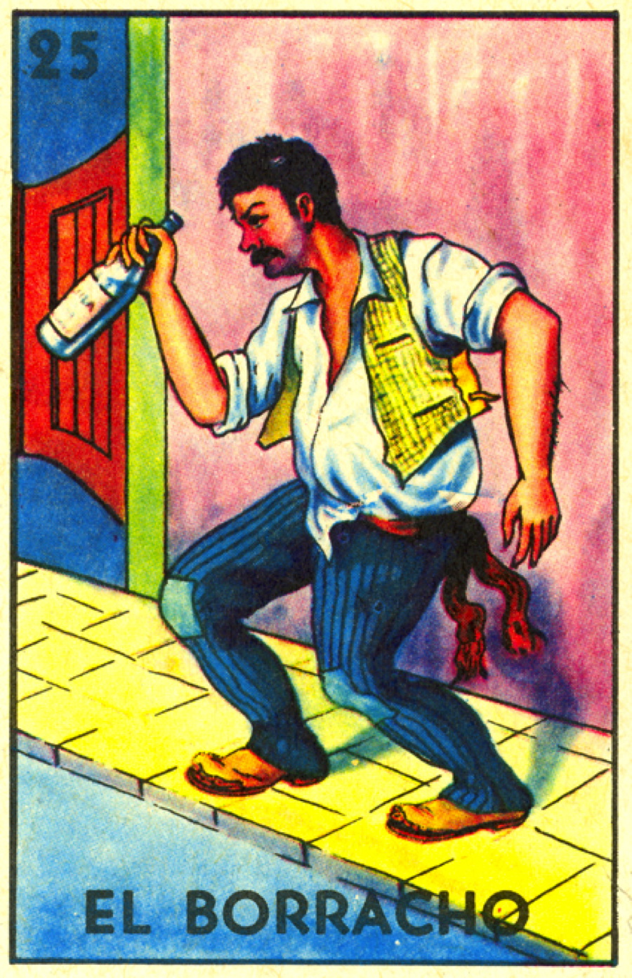
One of my favorite communication styles is that of the comic book, and I’ve scanned many, many examples, from boy-heroes to alcoholics.

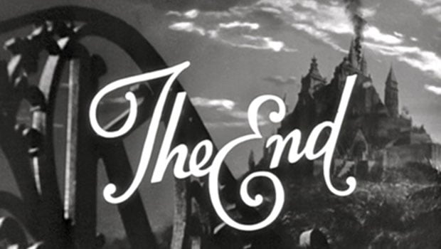
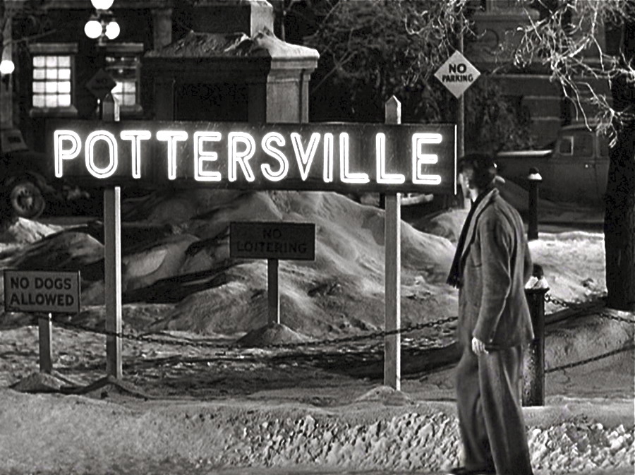
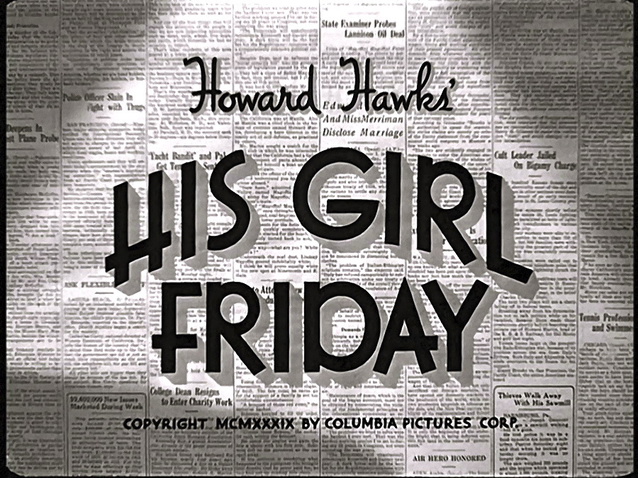
As a big movie buff, I somehow worked in movie-related themes over the years, though those weren’t technically scans, but rather screen shots.


Being a lapsed Catholic resulted in quite a few religious references.


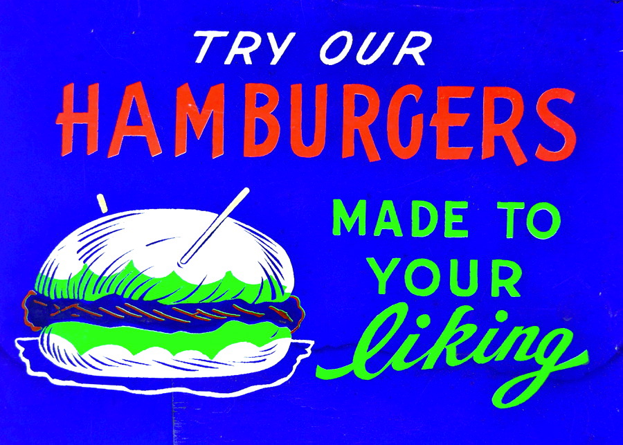
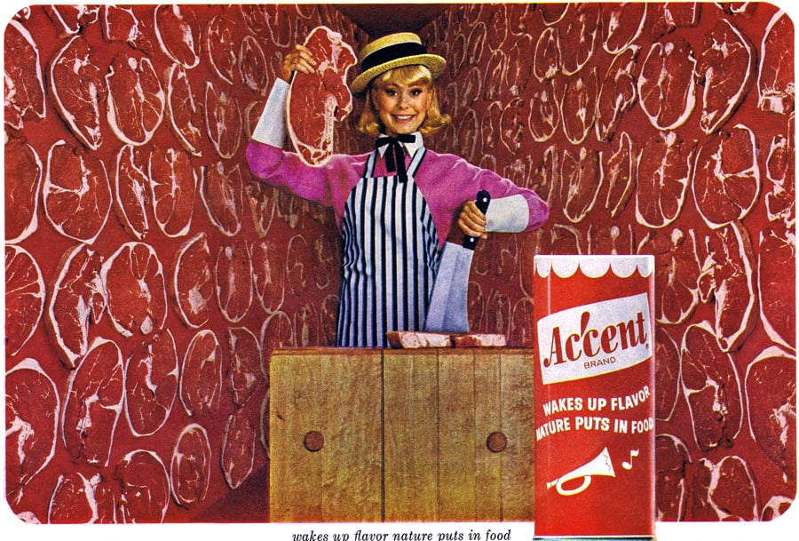
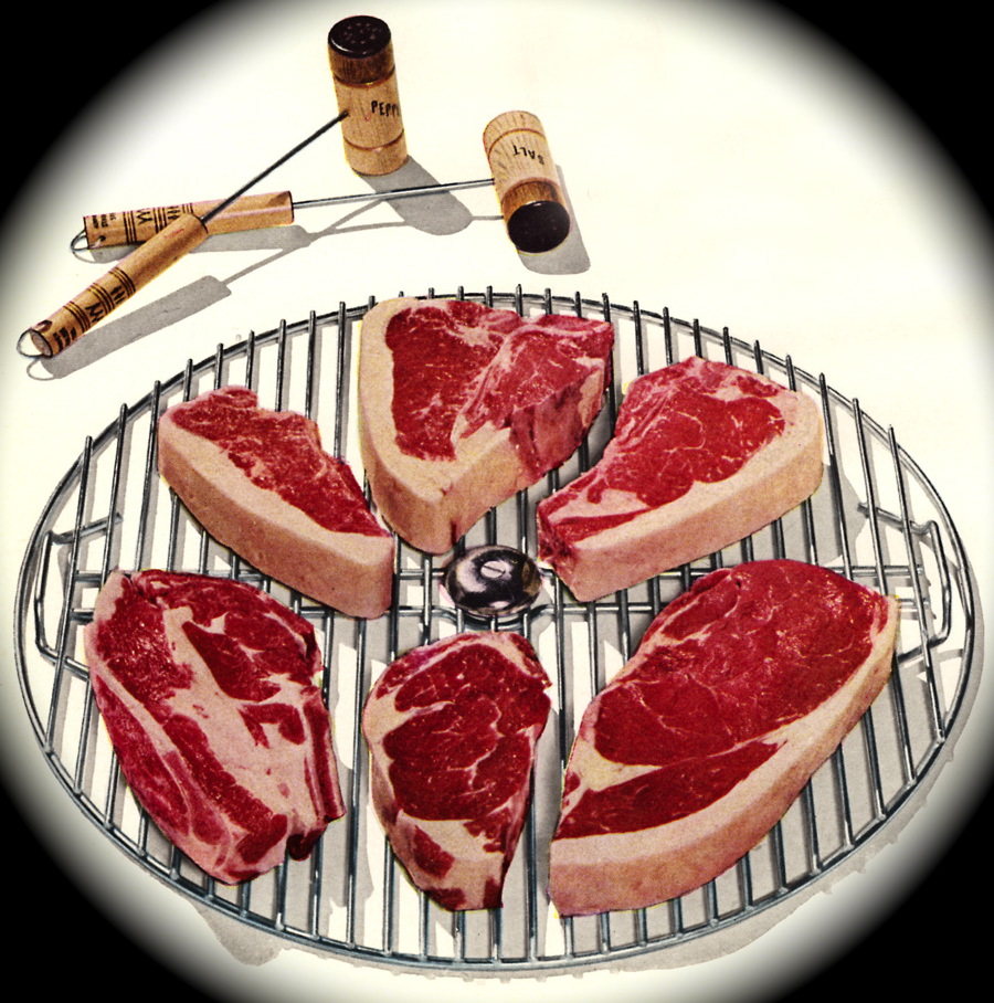
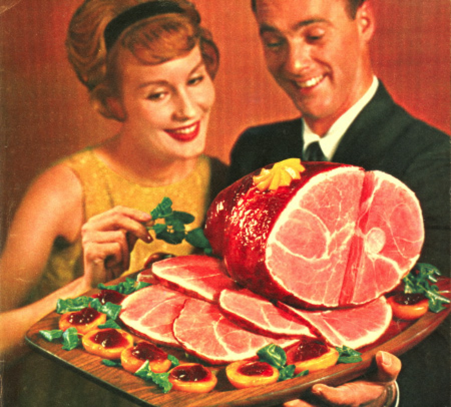
For some reason I ended up with quite a few images of meat, in articles ranging from barbecues to ham.
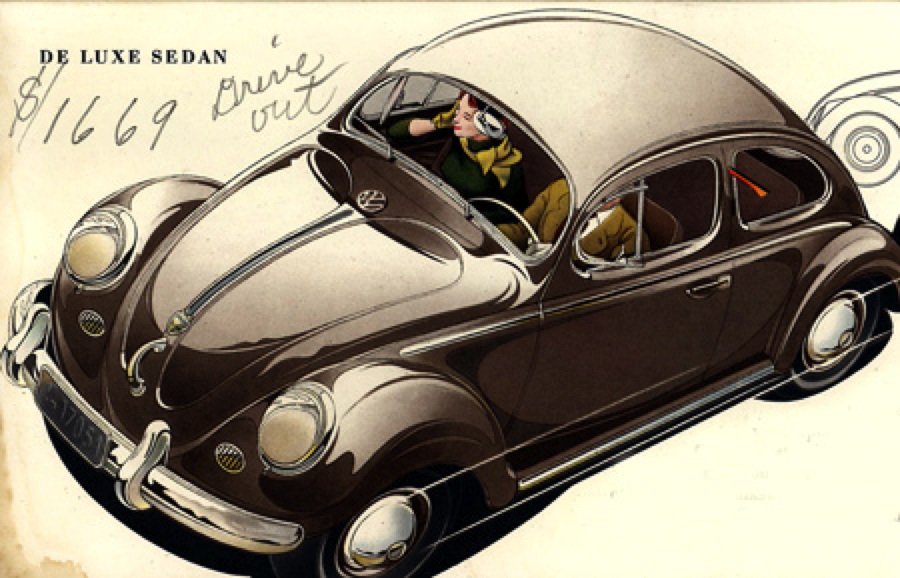
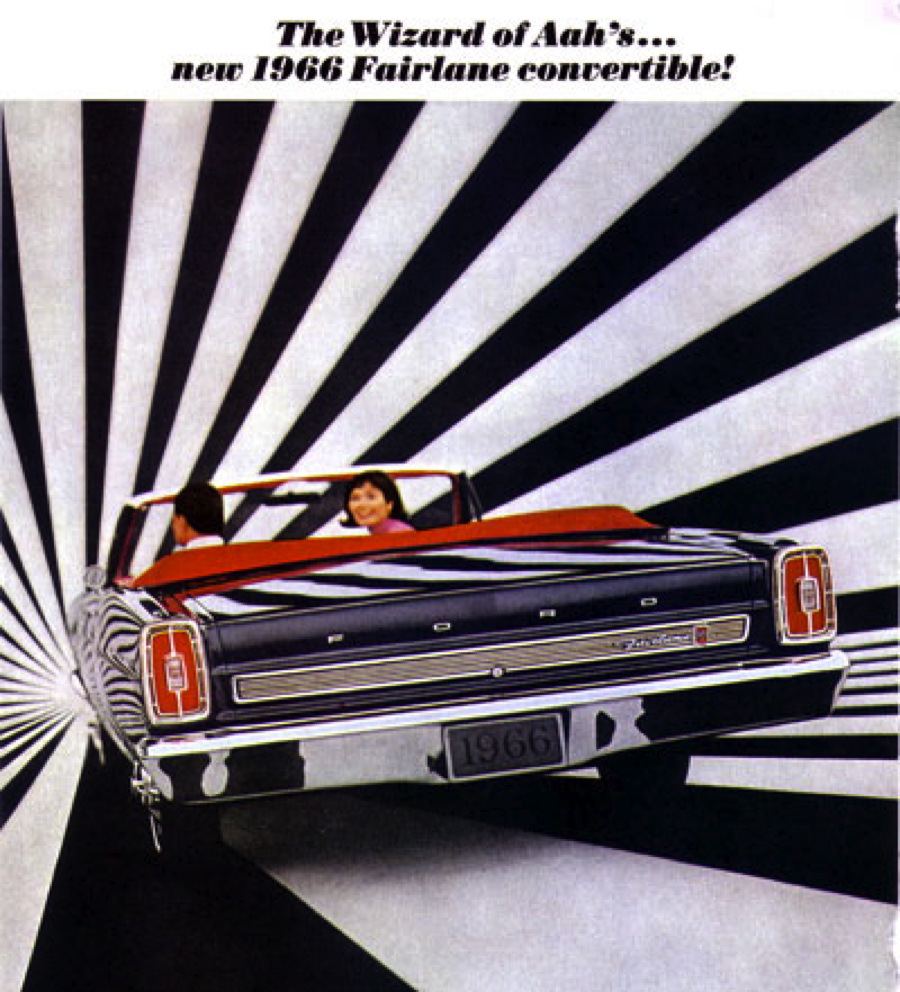
Automobiles figured heavily in my choices these past ten years – I wrote about station wagons, Volkswagens, Fiats and plenty of other cars.


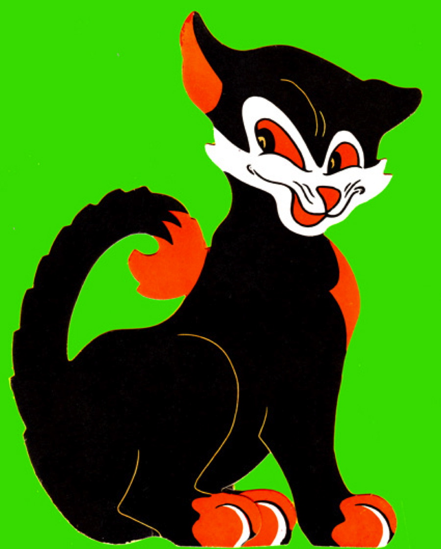
I’m drawn to the improbable and images that, by today’s standards, seem a little out-of-place, extremely dated or just plain odd.


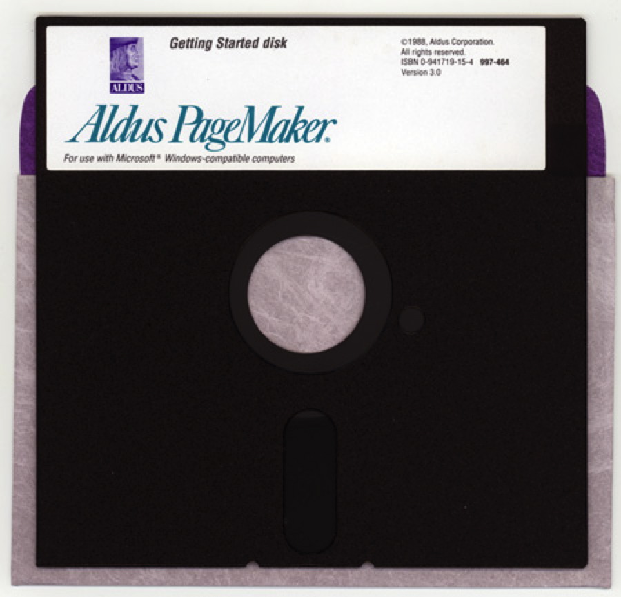
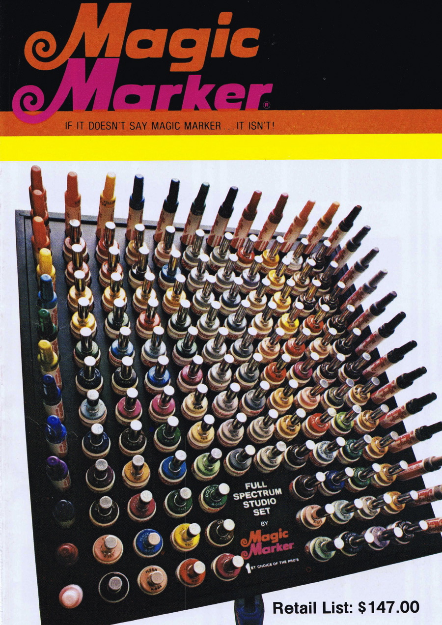
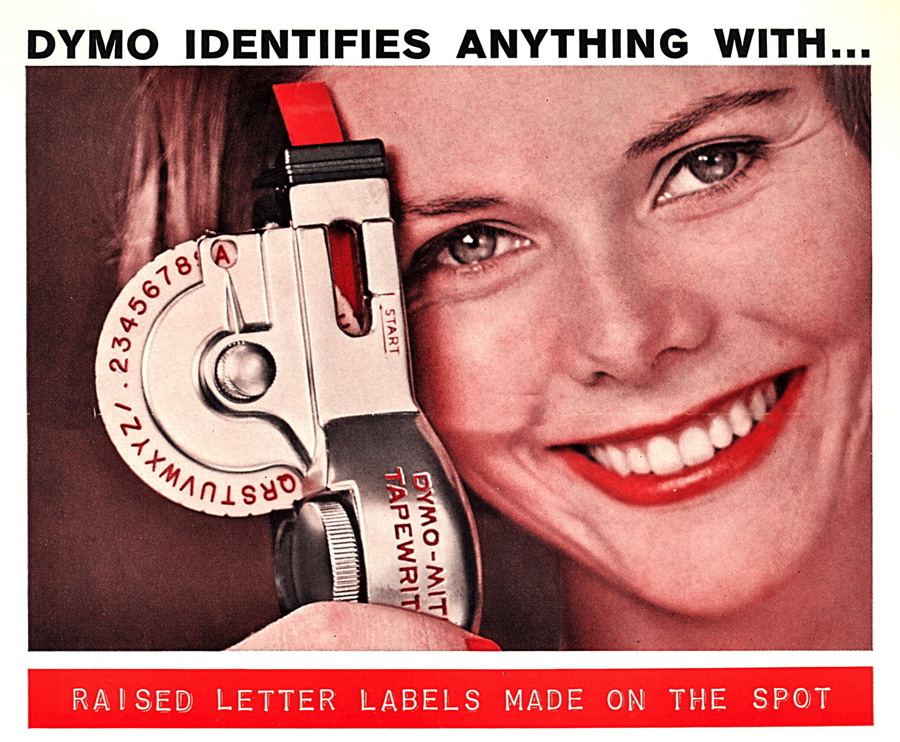
Technology has been a constant theme, from the early days of PageMaker to the era of magic markers, to Dymo label makers to Kodachrome slides and home movies.


And the following few images don’t fit anywhere else, but I wanted to include them because I like them.

Before I sign off, I need to thank a couple of people. Over the ten years at CreativePro I’ve had the honor to work with three different editors – each has contributed to my growth as a writer. I began with the encouragement of founding-editor Pam Pfiffner, who helped me find my voice and focus my efforts, then for so many years worked closely with Terri Stone, who guided my transition from writing monthly to weekly (and a lot more), and finally of late with current editor Mike Rankin, who I know will continue the excellent tradition at CreativePro. I now consider them all friends first and editors second.

I’d also like to thank the professional and friendly folks at Printing For Less, the parent company of CreativePro – if you haven’t tried them for any of your printing needs, I encourage you to do so. They run an excellent operation and it’s dog friendly, which I really appreciate!

Over the course of my column I’ve received so many thoughtful and nice comments, but feel compelled to single out two people, Mark Simonson (who often shared his typographic insight) and “Ajasys,” a reader I don’t know but who consistently posted meaningful commentary. I appreciate each and every comment from everyone, and certainly deserved the criticism that my writing sometimes generated (usually when I was self-righteous or lazy).
It’s been a privilege to have this forum at my disposal, and thanks again to everyone who has supported me over these past ten years.

This article was last modified on February 27, 2021
This article was first published on February 8, 2013
Commenting is easier and faster when you're logged in!