Pantone Predicts Colors for Spring and Summer 2013
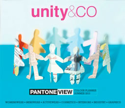
Pantone is a company known for its focus on color, of course, and for years now, Pantone has branched out from the chip books so familiar to graphic designers to issue a Colour Planner twice a year. This planner forecasts colors that the company believes should be prominent in several industries, including fashion, industrial design, and graphic design.

There are eight new palettes with a total of 62 individual colors for the Spring/Summer 2013 period:
• CO-nversation
Includes white, mauve, fuchsia, and sand
• CO-llaboration
Includes dusted pink, greeny-blue, and burnt yellows
• CO-nnected
Includes yellow and white
• CO-mmunity
Includes dry browns, watered browns, wood browns, and earth browns
• CO-ntain
Includes eggshell flesh tones, deep navy, and duck-egg blue
• CO-mpanion
Includes blues
• CO-llective
Includes strong fluorescents and sweetened pastels
• CO-nvivial
Includes brights with personality
The $750 Colour Planner includes text that explains the rationale behind the eight palettes, plus ideas for color harmonies and combinations. You’ll also get swatch cards of each of the individual colors; related digital imagery intended for presentations and storyboards; and a printed poster incoprorating all of the new palettes.


Which are probably as accurate as the Farmer’s Almanac for weather forecasting. I’m guessing that Pantone got a discount price on mauve and dusted pink inks? Somewhere, in the back rooms, there are a bunch of gnomes who think that if they *tell* people what colors are going to be popular, that somehow that *makes* the colors be popular.
i was wondering if there is any colour forecast for outdoor design for the spring of 2013?????