

Introducing Between: A New Typographic Triumvirate from Monotype
Between might seem like an odd name for a typeface – until you learn what is behind this seemingly strange moniker. Between is a new sans serif typeface family designed by Akira Kobayashi to help meet the widespread demand for both rounded and humanist sans serif designs. Inspired by his previous successful designs, Kobayashi set out to develop a DIN-like sans serif typeface, but with a friendlier personality. He observed that many corporations around the world were using rounded or humanist sans serif styles over the traditional Helvetica. Kobayashi’s goal was to make his design approachable, with a blend of coolness and warmth.

The Between family contains three styles – Between 1, Between 2 and Between 3 – with a total of 48 typefaces. Each of the three styles consists of eight roman weights with complementary italic designs. While all three states of Between are slightly different, they all offer a human-centered design to make their use more approachable and friendly. This suite of three contemporary sans serif typefaces features an ample x-height and generous counters for optimal legibility. The unique three-style variant is a key feature of the family. Each style represents a unique sensibility. Between 1 is a technical design, a blend between the grotesque and the friendlier humanist sans. Between 2 is an organic design, handcrafted to be warm and approachable. Between 3 is cheerful and lively developed out of casual handwritten letterforms.

The differences between the three versions of this typographic triumvirate are evident in the next two showings.
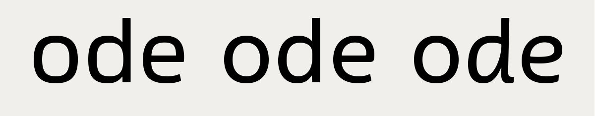
Their varying underlying skeletal structure is evident in these three characters.
“It started with the one in the middle,” recalls designer Kobayashi. “Between 2 was based on the idea of sans serif version of my Cosmiqua typeface. It strikes a balance between being crisp and highly legible on one hand, and organic and friendly on the other. In Between 1, I melded industrial and humanistic sans serif design ethics. Between 3 is a freestyle sans with an uplifting youthful demeanor. It’s a lighthearted combination of handwriting and sans serif letterforms.”
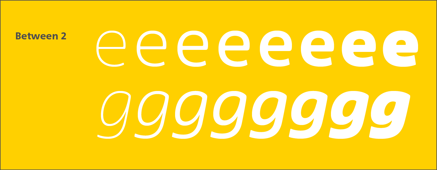
The variations of Between are subtle, yet contribute to a different vibe and overall appearance. All three share the same cap and lowercase x-height, and many of the same letterforms. As a result, there’s a fluidity between the designs. Certain characters, however, like the core components of a meal, make all the difference. Extract the ‘e’s and the ‘g’s, for example, and it’s easy to see the key ingredients.


Usage
Even though the Between typeface family has three distinct versions, each design has the ability to harmonize with the others. This allows designers options to use them interchangeably in order to create flexible design systems and a typographic hierarchy that blends well, rather than create a too strong contrast.
Individual letters can even be swapped in a word for subtle differences within a headline or logo. For instance, an editorial project could use Between 3 for a headline to attract the reader with approachability, while body copy could be set in Between 2, which is less playful and easier to read.


The Between typeface family is an inventive, refreshing twist on humanist typefaces. The availability of three distinctive yet harmonious versions can contribute to the creation of dynamic, creative design solutions, and is worth exploring.