How to Make Amazing Halftone Effects with Photoshop
Use a Photoshop method to explore and control creative halftone effects for print and web.

If you look really closely at an image in a printed newspaper or magazine you’ll see that what appears at first to be “continuous tone” (like a photograph) is actually constructed of thousands of tiny spots. This is called a halftone. But if you make those spots bigger, you break the illusion and the spots (or dots or whatever you want to call them) become an integral part of the image itself.
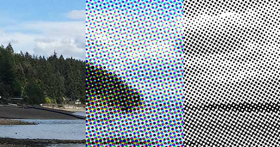
But how can you make these halftone effects yourself? It turns out to be super easy in Photoshop.
To make the four-color “rosette” halftone in the middle of the image above, I simply chose Filter > Pixelate > Color Halftone. On a color image, you get multiple CMYK dots of various sizes that overlap. But on a grayscale image, you get circular dots that vary in size:
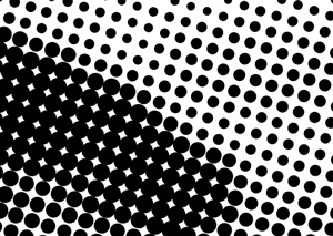
How to make better halftones
The Color Halftone filter does an okay job of making halftones, but there is another, far more powerful method. This is what I usually do:
- First, here’s the image that I’m going to be working with:
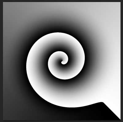
I made it by just creating an “angle gradient” in Photoshop and then running the Twirl filter on it. Now, I want a black-and-white halftone, so I convert the RGB image to Grayscale:

And then I head back to the Image > Mode submenu and choose Bitmap. When I do this, Photoshop asks me what I want to do with gray tones in the image:
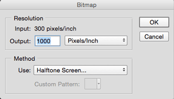
If I choose 50% Threshold from the Method pop-up menu—which is what most of us use when we switch mode to Bitmap—then Photoshop simply makes all my dark gray pixels black and light gray pixels white. Instead, to get my halftone, I choose Halftone Screen from the Use pop-up menu and click OK. This is where the real control lies:

You can choose a Frequency, an Angle, and a Shape for the halftone. In the image at the beginning of this article, I used the Round shape, which makes circles.
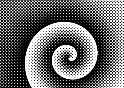
But if you look really closely, these are different than the circles that the filter uses. Instead of black circles that just get bigger and bigger, the darker tones are represented by white circles on a field of black:
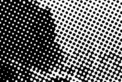
This is a more traditional halftone spot shape, reflecting how halftones really look in print.
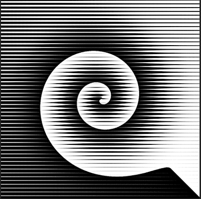
But you don’t have to use the Round spot here. You can use Line:
or Cross:
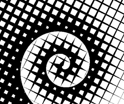
…or several other screens. Notice that I’m adjusting the frequency (lower frequency numbers make larger “spots”) and angle of the grid in each of these examples.
Adjusting image resolution for web
I skipped over one important setting earlier on in the Bitmap dialog box: the Output field. This lets you control the resolution of the image as you convert from grayscale to bitmap while applying the halftone effect. If you are planning on printing your image, you’re probably going to want to set the pixels per inch (ppi) to 1000 or more (for super smooth edges on your halftones, I would recommend 1500 or 2000 ppi).
If you’re just making web or other on-screen graphics, then you’ll want to set this to something smaller. While you may be tempted to use 72 or 96 ppi at this step, I would recommend that you first use 300 ppi or so.
Then, after you make the halftone, use Image > Mode to set it back to Grayscale. Change it back to RGB, and then change the resolution of the image, resampling it to 72 or 96 ppi using Image > Image Size.
This will result in a softer, more elegant effect. Now you can export as PNG or JPEG.
Save your image for print
If you are printing your halftone image, rather than downsampling it, you’ll save it as a high-resolution, bitmapped PSD or TIFF file. When Photoshop documents in Bitmap mode are saved, every pixel ends up either solid black or white.
The nice thing about bitmapped images like this is that you can place them in InDesign and then colorize them. (First select the image inside the frame, and then choose a color from the Swatches or Color panel.)
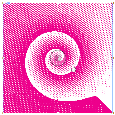
The halftone effect lets you create a vast number of variations from your images. Experiment! Play! Make multiple versions and overprint one over the other. (If you are creating artwork for publication, you might want to think twice—or at the very least, consult with your printer early in the process.)

Enjoy!
This article was last modified on October 14, 2022
This article was first published on June 10, 2015


