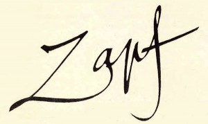
Hermann Zapf, ITC & Apple: The History of ITC Zapf Chancery & ITC Zapf Dingbats
On June 4th 2015 we lost one of the great ones. I’m speaking of Hermann Zapf, the highly regarded type designer, calligrapher, educator and lecturer responsible for some of the 20th century’s most important typefaces. Born in 1918 in Nuremberg, Germany, Hermann Zapf is most known for Palatino and Optima, as well as the calligraphic Zapfino. But his life’s work includes other influential designs as well. Zapf’s creations have been seen and put to use by both designers and non-designers alike, and are still being used every day by those who don’t even know his name or his legacy.
There have been many wonderful tributes to Mr. Zapf, both professional and personal, some of which are listed at the end of this article. So rather than repeat what has been beautifully and lovingly said, I will tell you about two of his creations that I had the privilege of witnessing become part of type and design history in my days working at International Typeface Corporation (ITC). I am referring to ITC Zapf Chancery and ITC Zapf Dingbats.
Hermann Zapf and International Typeface Corporation (ITC)
Hermann Zapf was a frequent visitor at ITC. Aaron Burns, the president of ITC (and my boss) who in his own right was a notable and influential typographic visionary, was his dear friend, colleague, and partner in “typographic” crime. After taking a decade-long break in the mid-1960s from designing commercial typefaces due to the proliferation of the “cloning” or “plagiarizing” of his designs, Zapf re-emerged in 1971 to work with Aaron Burns and the newly founded International Typeface Corporation. The designs he did for ITC consisted of the ITC Zapf Book, ITC Zapf International, ITC Zapf Chancery, and ITC Zapf Dingbats, all released between 1976 and 1979. The two that hold a major place in the history of digital typography are ITC Zapf Chancery and ITC Zapf Dingbats.
ITC Zapf Chancery
Most people – designers and non-designers alike – have either seen or used ITC Zapf Chancery. Why? Because it has been available on just about every computer since the mid 80s. ITC Zapf Chancery was licensed by Steve Jobs to ship with Apple computers running the Mac OS, and shortly thereafter was included as one of the core PostScript Laserwriter fonts in 1986. It was eventually included in the Windows OS as well. It then achieved great popularity and went on to become one of the most commonly used – and misused – typefaces in the world.
What most don’t know is that ITC Zapf Chancery was designed as a family of six weights, yet only one weight – the medium italic with swash – was licensed by Apple. So how did ITC Zapf Chancery find its way to Apple? According to Allan Haley, who was Director of Marketing for ITC at that time, “Aaron Burns contacted Steve Jobs. ITC had learned that Adobe was pitching several typefaces to Apple that would be part of the LaserWriter’s printer font offerings. We had been marketing a suite of our typefaces to printer and computer manufactures for a couple of years prior, but without much success. When he learned of Job’s decision – and it ultimately was his decision which typefaces went into the LaserWriter – Burns reached out to Jobs in a letter. That was the beginning of a brief, but close, friendship between the two men.”
Why was this particular weight chosen from a family containing four Roman (upright) versions and two italics? Allan Haley explains, “Because that was the design Steve Jobs liked. It was pretty much that simple. While not a typographer, Jobs appreciated the value of typographic communication and had a more than fair understanding of type and typography. Jobs also had an early appreciation of calligraphic lettering.”
In spite of the misuse and overuse of the singular medium italic weight, the ITC Zapf Chancery family is a classic design that still has relevance today. When properly used, the unadorned, swash-less roman versions are elegant and legible, while the italics are fitting when a more decorative appearance is desired. There have been many lookalikes and knockoffs since, but the credit goes to Mr. Zapf for the original design and concept.
ITC Zapf Dingbats
ITC Zapf Dingbats is a collection of printers’ embellishments, graphic symbols and other practical and decorative images that are great for print as well as onscreen applications. This ever-popular suite of dingbats was designed by Zapf for ITC in 1978, and went on to become the most well-known dingbat collection. Zapf Dingbats are frequently used as bullets, end marks, paragraph separators, check marks, cutting line indicators, borders and patterns, as well as purely decorative elements that can be enlarged and colorized for added impact.
Zapf created the original dingbat collection consisting of around 1,000 images in the mid-1970s. ITC then selected 360 and released them in 1978 as ITC Zapf Dingbats. In 1985, Steve Jobs selected it to become one of the standard fonts to be included with the Apple LaserWriter. It then became enormously popular, even among people with little experience with, or knowledge of, typefaces and printing.
Although there have been many similar dingbat collections since then, many of which are now part of most Mac and PC operating systems, ITC Zapf Dingbats is the true original, and one for which total credit is due Hermann Zapf for his foresight and originality.
* * * * *
More about Hermann Zapf:
Remembering Legendary Man of Letters Hermann Zapf
In Memoriam: Hermann Zapf
The Lifestory of Hermann Zapf
The Art of Hermann Zapf (video)


You’re forgetting that Zapf Chancery has fully designed small caps, which worsens the crime of including only one weight and style in printers.
Joe, the original release did not have small caps. See the U&lc spreads show in the article for the extra characters, but most were not included in the early digital font formats. Note all upright versions did have alternate swash caps, and the italics had unadorned caps as alternates, all shown in the U&lc pages, but again not included in the early digital formats which did not have room for them.
Referring to Zapf Chancery, you say “when used properly.” Normally, that goes without saying for any typeface. But you said it, implying something one must do beyond the typical good use to make Chancery well used. So would you mind explaining this?
Thanks much.
Robin, in general I meant a use that is appropriate for the specific content and overall design. But I am also referring to not setting the medium Italic, or the other swash versions, in all caps.
Ilene. My compliments on your Hermann Zapf article—don’t wanna call it an obit. Your article was warm, solid, informative, and not overly formal. And you included info on early Steve Jobs, whom I once saw at the Type Directors Club at 2 Dag Hammarskjold but had no idea who he was. He had hair then. (And those days mine was red.) The examples you show are so informative. And you mention ITC’s Aaron Burns, whom I describe as the ultimate urbane gentleman. He defined the word “mensch.” Anyway. Good job! Thanks.
[…] images—part of a long tradition that can be traced from the rare emoticons of the 19th century to Zapf Dingbats to The Print Shop to […]
[…] images—part of a long tradition that can be traced from the rare emoticons of the 19th century to Zapf Dingbats to The Print Shop to […]
[…] images—part of a long tradition that can be traced from the rare emoticons of the 19th century to Zapf Dingbats to The Print Shop to […]
[…] images—part of a long tradition that can be traced from the rare emoticons of the 19th century to Zapf Dingbats to The Print Shop to […]
[…] images—part of a long tradition that can be traced from the rare emoticons of the 19th century to Zapf Dingbats to The Print Shop to […]
[…] images—part of a long tradition that can be traced from the rare emoticons of the 19th century to Zapf Dingbats to The Print Shop to […]