

Cosmopolitan Magazine Redesigns

Luke Hayman, Rami Moghadam, and Braulio Amado of the Pentagram design agency recently worked with Cosmopolitan‘s editor in chief and design director to give the magazine a makeover. The redesign debuts with the January 2012 issue, which just hit the newsstands.
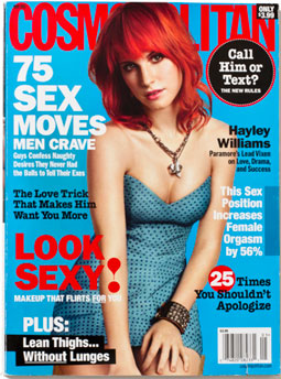
A cover before the redesign:
A proposed redesign:

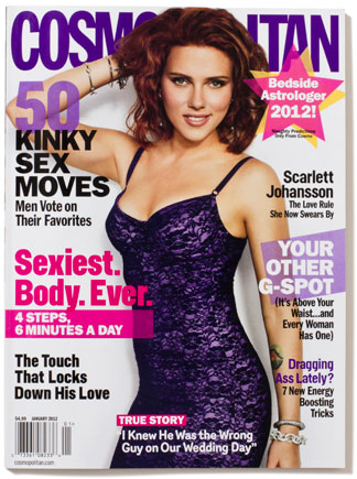
The actual, redesigned January 2012 cover:
Editor in chief Kate White says the aim of the redesign was to produce something that didn’t “look like a magazine”. To that end, you’ll find less text and more imagery. Pentagram also ditched justified text for left-aligned columns and introduced a dynamic quality with partial transparency, angled shapes, and layered elements.
An article before the redesign:

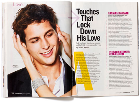
Examples of post-redesign articles:


Here’s a before-and-after comparison of the table of contents:


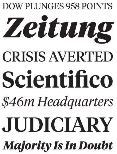
Pentagram used four new typefaces for the redesign:
Helsinki:

Parry:
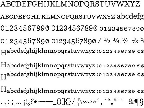
Router:

Tiempos:
What do you think of the redesign? Does it succeed in “not looking like a magazine”? Is that a good thing? Click the word “Comments” below this article to give it the thumbs up or down. To see more examples from the January 2012 issue of Cosmo, go to the blog post on the Pentagram website.
It looks like every other magazine in the women’s section – isn’t that what you want so we have to look through them all to find one of substance?
The interior is a SLIGHT improvement. The cover is still extremely schmaltzy and still looks exactly like every other cheap magazine.
KUDOS to the attempt of a design haul in the January issue. Its a surprising change from the December issue. I welcome the new look for the table of contents. Its much more fun and eye catching. While the fonts and colors work well in that section, I find that the choice of this different font in the copy heavy stories very hard to read. The kerning is too tight for a serif font and it overwhelms the page. (Example on page 24) As an avid magazine reader, I find myself not wanting to read the content which is a selling point.
Some of the headers also look cut off at the top of the page, like there was not enough bleed provided. Making it look like a mistake. (Ex. p 158) The play of the different fonts in different colors and weights for headers and subheads was not very well thought through and looked premature-which made this issue a bit disappointing. I flipped right through concentrating on the images as opposed to the articles. Aesthetically the old issues had a consistent look and easy read thru. The copy, fonts and images had a good proportional flow and layout that happens consistently which encourages a good read. The new look would work if the creative changes were somewhere in between.