

TypeTalk: Most Notable Fonts of 2015
Does the world need more typefaces? That is akin to asking if we need more shoes, recipes, or even music! We have plenty to go around, but the continuous demand for something new, fresh, and visually expressive will never disappear. So the answer is, of course we need (and want) more typefaces!
In response to that demand, hundreds of new designs are released each year. The challenge for every designer is not only to keep up with what’s new, but to be able to distinguish which are professional, well-executed designs from those that are weak concepts and/or poorly constructed. What follows is a group of eight exciting typeface designs from reputable designers and foundries, all released last year. Many have great backstories that led to their design, which serve to remind us that behind every design is an actual person with a story for each particular typeface.
Here is a selection of some of the most notable fonts of 2015:

 Basel Roman | P22
In mid 2001, P22 was approached by a Daniel Garrison, a Classics scholar at Northwestern University about possibly digitizing a long lost “Garamond” typeface. This font was used by Johannes Herbst (a.k.a. Ioannes Oporinus) in 1543 to publish Andreas Vesalius’ On the Fabric of the Human Body (De humani corporis fabrica) in Basel. The story of the development of Basel Roman takes a few twists and almost becomes forgotten itself over time, yet 14 years later, this very exciting historic revival it is available to the public. The expanded OpenType functionality allowed for the inclusion of ligatures, small caps, and historical sorts, as well as other typographic features and extended language support.
 FF Eggo | FontFont
FF Eggo by Lukasz Dziedzic is a sturdy, casual script available in five weights with companion italics, making it an extremely practical, flexible family for a multitude of uses. The goal was to create a design that looked like it was written by a letterer on a sign or chalkboard. Dziedzic explains, “Most script fonts only work with lowercase, when capital letters are used only at the beginning of words. I wanted my uppercase letters to also work in all-caps settings. So I chose a plain, dynamic style, quite upright model.”
The uppercase works on its own, but it also mixes well with the lowercase, which is more classically calligraphic. The thin style looks like it’s written with a pen or thin marker, while the bolder ones could be done with a brush or a marker. The upright styles are a bit more casual, and the italics are a bit more classic.
 Municipal Cast | House Industries
Municipal Cast is a powerhouse design with an interesting backstory. The inspiration for this assertive slab serif was manholes! Designer Ken Barber developed a latent appreciation for the manhole covers he was stealing. Municipal Cast’s sturdy slab serif construction and confident voice was inspired by the backbreaking work of prying those heavy cast iron discs out of the roadway, making it the ideal choice for commanding headlines, brawny logos, industrial-strength advertisements and public nuisance crime wanted posters. Want to add some muscle to your designs? It’s tough to ignore the clarity, punch and weight of Municipal Cast.
 Notary | Terminal Design
Notary is an historic revival of the classic sans, Record Gothic. Designer James Montalbano explains, “There is no denying the popularity and usefulness of the American Gothic trinity of Trade, News and Franklin Gothic. I wanted to incorporate an American Gothic into the Terminal Design library so I chose Ludlow’s Record Gothic, a quirkier version of that genre. Wanting to remove my innate sense of letter proportion from the development I decided early on to slavishly follow the proportions of the original Ludlow design. Many of the drawing decisions this led me to were at first shocking to my sensibilities. Rather than “correct” what I saw as errors I kept them in the spirit of authenticity.” Notary contains eight weights with companion obliques.
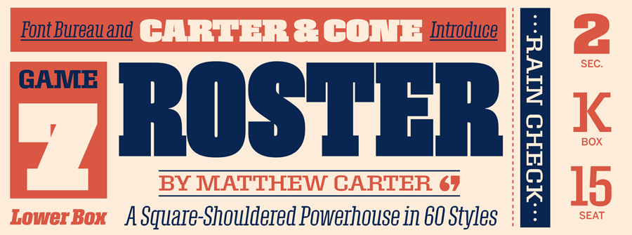
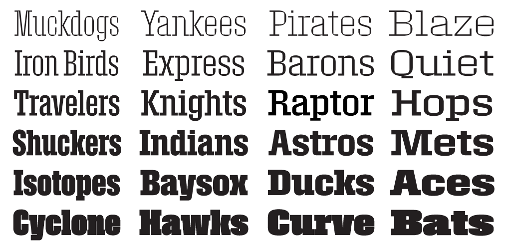 Roster | Font Bureau
Roster, the latest release from Font Bureau and Carter & Cone, is a really big deal—literally! Originally designed by Matthew Carter in the 1990s, Roster has been expanded from its original seven styles to the current 60: six weights in five widths plus companion italics.
This square-shouldered powerhouse is a slab serif with a difference. Roster’s outer shapes are large, curved rectangles; its inner shapes have the chisel-cut clarity of counters carved out of the surrounding letterforms. This chiseled effect lends a quirky constructive element to the family; a sort of visual push-pull that’s most evident in the lighter, narrower styles. The effect is both eye-catching and solid.
Roster is a typeface intended for display: the very smallest size recommended is 30 pt/pixels, although the very heavy and compressed styles may need to be bigger. It flexes its muscles best at truly large size.
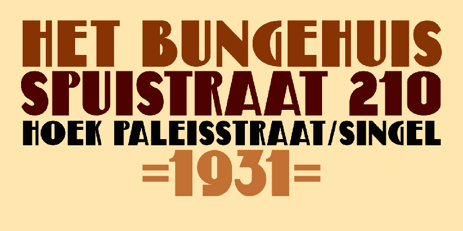 Bungehuis | MyFonts
Bungehuis by David Kerkhoff was modeled on the lettering found on an Amsterdam art deco building from 1931. This building on the Spuistraat, also called “Het Bungehuis”, used to house offices, but is now part of the University of Amsterdam. Bungehuis is a heavy art deco font in an upright and an italic version, and would look great on posters and in headlines. It comes with a rather democratic range of diacritics.
 Phoreus Cherokee | TypeCulture
Phoreus Cherokee is TypeCulture’s best selling font of 2015—an interesting statistic for a typeface originally conceived and designed for the Cherokee language. Designer Mark Jamra explains, “The Phoreus project arose when I saw a conference presentation by representatives of the Language Technology Office of the Cherokee Nation in Tahlequah, Oklahoma. They were speaking about their efforts to integrate the Cherokee language into current technologies, and they finished their presentation with a request to type designers to create Cherokee typefaces. They said new digital types were required to build the resources they needed to preserve their language and culture. And I thought, ‘This is it. I have to do this.’ I contacted them after the conference and started almost immediately.”
Special care was taken to create forms that facilitated the learning of the Cherokee language amongst children as well as the setting of bilingual texts in Cherokee and English or Spanish. Learn more about this project in this video.
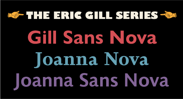 The Eric Gill Series | Monotype
The Eric Gill Series is a collection of 77 fonts in three families: Gill Sans Nova, Joanna Nova and Joanna Sans Nova. All the typefaces are derived from the original work of the influential British artist, sculptor, letter-cutter and type designer Eric Gill (1882–1940). These are contemporary digital typefaces that pay homage to Gill’s original designs. The Series also brings to life new elements inspired by some of Gill’s unreleased work that have recently been discovered in Monotype’s archive of original typeface drawings, designer correspondence, and documents from the last century. Read more about Gill Sans Nova and the rest of the series here.