

TypeTalk: Typographic Hierarchy
One of the most important aspects of designing with type is the establishment of an effective typographic hierarchy. Typographic hierarchy refers to the styling and arrangement of the content in a way that signals the levels of importance to the audience. Whether it be for print or screen (the Web, ebook or app), it is up to the designer to organize the content so that it leads the viewer through the piece, determining what they will see first, second, and third. The most effective typographic hierarchy does this in a manner that is not only functional, but aesthetically pleasing as well.
Factors that affect typographic hierarchy
The following factors contribute to the creation of typographic hierarchy. Note that while these are general guidelines, any of them can be “upstaged” when combined with other elements in a layout or composition.
Type style
The chosen typeface(s) contributes greatly to establishing hierarchy, especially for prominent elements such as headlines, subheads, and even pull quotes. In general, more decorative, stylized, or assertive typestyles command attention and denote importance. But so can an ultra light version in the right setting. Contrast is the key, not necessarily big, bold, and brash.
Weight and version
A heavier weight will usually attract more attention than a lighter one, and also denote a higher level of importance. An italic or oblique typestyle can also draw the viewer’s attention, especially when it contrasts with neighboring roman (upright) type.
Type size
In most instances, the eye is drawn to the largest type first. Thus, one typically notices the headline first, (which is usually the largest type), then moves on to the other elements. But note that this is also dependent on other aspects of the design that might affect the hierarchy, and potentially deflect attention away from large type.
Case
An all cap setting can work well in small doses to draw attention and denote importance, especially when used for a heading or subhead. On the other hand, upper and lowercase settings are the easiest to read for lengthy settings or the body text that follows.
Spacing
The space between and around each element contributes to the establishment of hierarchy. Keep related elements together, while separating others to create emphasis, contrast, and an overall good organization.
Alignment
The alignment of the typographic elements can contribute to their implied level of significance. For instance, centered type imparts a feeling of importance and attracts the viewer’s attention, which is why it is often used for titles, headlines, and other primary typographic elements.
Color
The use of color can help create and support a desired hierarchy. Keep in mind that that too much color use in too many instances will dilute its effectiveness. “Less is more” when it comes to color.
Margins and gutters
Generous margins help draw attention to the content within, while narrow gutters help keep related columns together. You’d be surprised how the adjustment of these seemingly small details can affect a layout and the overall hierarchy in a major way.
White space
The addition of white, or negative, space in a composition can be used to create emphasis and draw attention to important element(s). Resist the temptation to fill up every bit space, which can create too much visual noise that can confuse the viewer.
Examples

The text is placed under the client’s logo with some very basic formatting. This includes centering the text for a sense of importance, and the addition of space to begin separating the elements.
Preliminary fonts and weights selections are made, spacing is tweaked a bit more to divide the elements, and the use of small caps, all caps, and oldstyle figures is assigned for additional contrast, all of which help establish the hierarchy.

The weight and size of some elements are adjusted to emphasize the more important information, including the name of the ballet, and the featured dancer. Ornaments are added below the logo to add graphic interest as well as create a sense of separation from the content below.

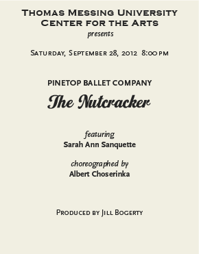
The addition of color is the final touch, creating a more lively, eye-catching composition. Color also adds emphasis to the most important elements, namely the ballet title and the dance company. The rest of the text is now dark gray, allow it to recede a bit more from the red and green type. Set in Copperplate Gothic, Scala and Scala Sans, and Home Run.
Guidelines
Keep the following guidelines in mind to help in the establishment of a strong typographic hierarchy:
• Select a typographic focal point to draw the viewer in.
• Keep the most important information highly visible.
• Create contrast, not conflict, disorder, or visual confusion. Type and image should work together.
• Step away from and/or print out your work early on. Notice what you see first, second and third.
• Adjust and tweak the layout and the typography accordingly to achieve your desired objective.
It is easy to overlook the visual and typographic hierarchy when trying to be original, creative, and responsive to the needs of the client. But paying attention to this very important aspect of design will assure that you get the message across in the most effective way.
***

Ilene Strizver, founder of The Type Studio, is a typographic consultant, designer, writer and educator specializing in all aspects of visual communication, from the aesthetic to the technica
l. Her book, Type Rules! The designer’s guide to professional typography, 4th edition, has received numerous accolades from the type and design community. She conducts her widely acclaimed Gourmet Typography Workshops internationally. For more information on attending one or bringing it to your company, organization, or school, go to her site, call The Type Studio at 203-227-5929, or email Ilene at [email protected]. Sign up for her free e?newsletter, All Things Typographic, at www.thetypestudio.com.