
Mark Jamra, noted type designer and educator, had a vision of combining his passion for typeface design and his love of education; the result of that vision is TypeCulture. This dual website is both a showcase for Jamra’s stunning, award-winning typefaces, as well as a rich academic resource for design students, educators and professionals who are seeking information about type. The foundry contains beautifully designed examples of font usage, downloadable PDF type specimens, as well as the story behind each design. The academic resource contains in-depth articles and essays, short documentaries that capture valuable moments in typographic history, a research directory, as well as education extras such as excerpts from letterform design workshops, design seminars and explorations into type design and typography. All in all, it is a site that should not be missed by anyone who loves, uses, and/or teaches typography.
We sat down with this classically trained, gifted designer and educator to find out what motivates and inspires him, as well as how it all began…

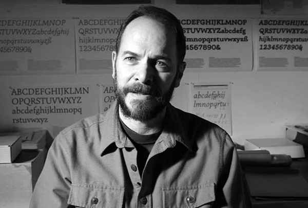
The designer in his studio. Photograph by Dean Merrill.
How did you get your start in becoming a typeface designer? Was it something you always wanted to do, or did you find/fall into it?
I’ve drawn letters just for fun as far back as high school, but I learned to love type during my graduate studies at the Basel School of Design in the early ’80s. It was just something I took to naturally, probably because there was a sense of gravity and permanence to it, and those were things I had been looking for in design.
Also, I think it was the sheer challenge that attracted me to it. Back in those days, there weren’t many people who designed type, so those that did were quite good at it. There weren’t many type design amateurs or hobbyists, contrary to today. You either produced good quality work or you didn’t get into the market. So breaking through that wall and becoming one of those professionals was a challenge that I found very attractive. Type design was also something that I seemed to have the right character for; the combination of focus and doggedness necessary to design a multi-font family over a period of years.
After graduate school, it was clear to me that I had to spend some time in type production—I had to cut my teeth and build my chops, as they say in music. So I worked for a couple of years in the production department of URW in Hamburg, Germany, producing and designing extra glyphs for ITC typefaces. That was a valuable experience and it taught me about the type industry. I worked on a couple of my own type families after that, and somehow found time to work as a graphic designer and teach some letterform design classes at the local polytechnic college.

Alphatier Pro is an innovative typeface design combining form and function, and challenging convention.
Who was your most influential instructor or (typeface) designer? Why?
The two letterform instructors at Basel, André Gürtler and Christian Mengelt, got me started. Early on, I was inspired a lot by Adrian Frutiger, who has always been the type designers’ type designer. Later, the work of Czech type designer Oldrich Menhart expanded my idea of what was “beautiful” in typefaces. His work was like nothing I’d seen before. German writing master Martin Andersch put me through a program of writing historical hands and expressive calligraphy that had a profound influence on my work.
What inspires you in your choice of type design projects? Do they require research or is it all from your head (at this point)?
Until recently, I would continuously seek out an aspect of type or a way of designing type that I hadn’t tried before. I basically followed my curiosity and sought out artistic challenges. These projects would of course be influenced in some way or another by what I learned along the way. I spent a lot of time—many years in fact—learning about where letters came from, how they evolved over the centuries and the fundamental aspects of the reading process. In other words, I learned what was necessary to be able to understand my work in an historical context and to have it function as well as possible.
Recently, I’ve had to do a lot more research when starting a project because I’ve gotten into non-Latin scripts and it’s important to learn as much as possible about a script’s origin, its history, and the culture of its language community. The research is now a major part of the fun; I love learning about languages, history, and different cultures. It’s really a very gratifying pursuit and has opened up a whole new world for me in type design.
You’ve been designing type for a while. What typefaces are you most proud of, or were the most challenging?
I’m still particularly proud of Kinesis. I started it when I had been designing type for about 8 years and it was the first typeface I did that had a truly high level of accomplishment in both concept and execution. I guess you could say it was my masterpiece, in the original sense of the word. It’s still a unique design that stands very much by itself in the larger spectrum of typefaces.

Kinesis Pro is a unique text typeface with uncommon forms firmly rooted in vibrant, expressive calligraphy.
I’m also proud of Expo Sans for two reasons: first, it became a pretty special and readable sans serif, even though I began it without wanting to create something “new.” Entire books have been set in it and it performs exceptionally well. And secondly, a few designers have told me that they love it because it’s so easy to use, they can use it anywhere and it makes their jobs easier. That’s a great compliment to receive from type users.

Expo Sans Pro, a highly legible, multi-functional typographic workhorse with heart.

Expo Serif Pro is a warm and abundant book face for complex and demanding typography.
And then there’s my latest design, Phoreus Cherokee, which was a very challenging project. First of all, it’s a syllabary—not an alphabet—and so I had to look at everything I was doing in a completely different way. It was a fantastic learning experience. Also, it’s great to have created something that will actively help in the preservation of a native American language and culture.
What motivated you to design Phoreus Cherokee?
By 2010, I had been designing type for close to 30 years and had begun to search for opportunities in type design that were more meaningful—something that would have a positive impact on the lives of the people who experience the type I create. The Phoreus project arose when I saw a conference presentation by representatives of the Language Technology Office of the Cherokee Nation in Tahlequah, Oklahoma. They were speaking about their efforts to integrate the Cherokee language into current technologies, and they finished their presentation with a request to type designers to create Cherokee typefaces. They said new digital types were required to build the resources they needed to preserve their language and culture. And I thought, “This is it. I have to do this.” I contacted them after the conference and started almost immediately. It would take up more time than we have here to tell you how much I learned from this project. It was fantastic.

Phoreus Cherokee is an inspired work of artistry, craftsmanship, and passion by this seasoned typeface designer.
Tell us more about the syllabary—and does the typeface also contain all the characters of the regular Latin alphabet?
The syllabary consists of 85 glyphs that, on a phonetic level, represent all of the syllable sounds in the Cherokee language. But that’s only part of it. Contrary to the Latin alphabet, the glyphs in the syllabary can also contain up to 4 levels of meaning, making it an effective writing system for a fairly complex language. Many of the glyphs resemble Latin characters (there are historical reasons for that), but they have nothing to do with the sounds represented by their alphabetic counterparts. Don’t forget that the glyphs represent entire syllables, so relatively few Cherokee glyphs can constitute an entire sentence.
Phoreus Cherokee contains a full complement of Latin characters as well, because it’s often necessary to insert non-Cherokee words or names into a text. Also, bilingual texts can be set that maintain the same color and character—for example in a Cherokee language primer, dictionary or textbook.
What’s happening right now is that non-Cherokee people are also purchasing licenses for Phoreus Cherokee because they’ve found the Latin complement to be very attractive. This is a nice bonus, and very gratifying to me.
What is your process? Do you work entirely on the computer, or sketch first?
I still sketch initial ideas and draw the basic glyphs of a typeface, but the computer has really taken over most of the process because of all the technological environments that typefaces have to perform in. The decisions that I have to make to accommodate those technologies require that I’m working on the computer early in the process. But the creation process has remained the same, regardless of the technology: I work on a concept, trying out ideas and pushing on boundaries, until a singular, cohesive personality emerges. Then it gets really exciting, because the design itself begins to “tell” me what it needs and the process changes from pure exploration into a kind of dialog between me and the typeface. This goes until I can responsibly “abandon” development—a typeface is never finished. What continues from there is the tedious part: spacing, kerning, hinting, writing OpenType features, all the technological stuff.

Latienne Pro, a fresh, lively design with a broad range of advanced OpenType typographic features.
TypeCulture, your twin type foundry/academic resource web site has just reached its 10th anniversary. How has it changed?
It hasn’t changed much at all. In the beginning, I wanted TypeCulture to reflect who I am; whenever I’m asked to write down my occupation, I always write “Designer/Educator.” And the website pretty much reflects that. On the one side is commerce—my work as a type designer—and on the other side is academia, where I want to provide a reliable resource for students and other educators. The key word there is “reliable,” because as we both know, there’s a lot of nonsense on the internet; lots of stuff that’s just plain incorrect. I try to avoid that in the TypeCulture Academic Resource, so there’s always an ongoing editorial process.
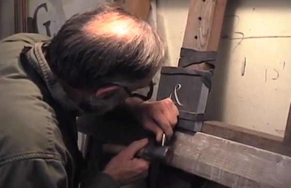
Douglas Coffin, Lettercarver, is a mesmerizing film about the artistry and craftsmanship of one of a handful of people in the United States who carve letters in stone with the same methods that were used in the Roman Empire.

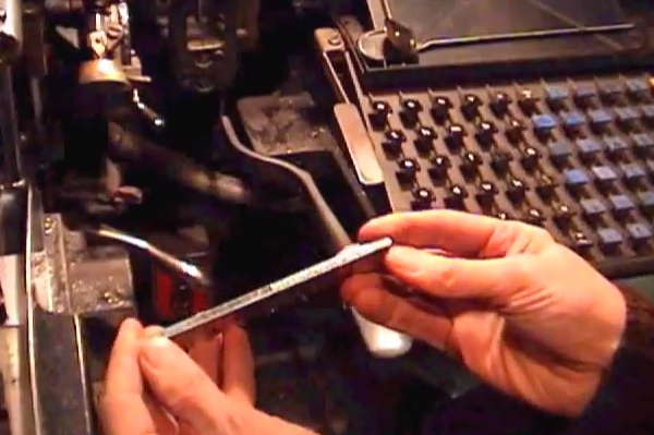
A still from The Ludlow Typograph Machine, a documentary about the hot-metal typecaster for headlines; a machine for big type that combines hand composition and Industrial-Age technology.
The Linotype is a short film about one of the most intriguing machines of the Industrial Age.
How do you blend/manage your interest and passion for both typeface design and education?
It’s not that difficult, really. Along with my teaching at Maine College of Art, I’ve been asked to conduct numerous workshops at other institutions, so that allows me to meet other educators and students in different programs. In the classroom, I get very excited about type, and I enjoy passing that excitement onto students and getting them passionate about it too. Also, the work I do with students always has me looking at letterforms in different ways, so it’s a constant learning process—for them and for me.
Any words of advice for students, teachers and professional designers with respect to typography?
Learn as much about type as you can—even if you never intend to actually design type. The extended exposure to typefaces and type history will heighten your sensitivity to the differences in “virtue” between the various typefaces. And learn a little about how people read (it’s been researched extensively), so that you’re not applying the rules of typography without understanding why they’re rules. Some of the rules have to do with style conventions, but many rules have to do with accommodating the reading process.
This article was last modified on April 29, 2022
This article was first published on October 15, 2014
Commenting is easier and faster when you're logged in!

Recommended for you

TypeTalk: Set Fractions Faster in InDesign
Q. Is there a quick, easy way to format fractions when you’re using fonts...

2018 Font Purchasing Habits Survey
Have you ever wondered how your font choices, habits, and knowledge compare to o...

Lost Type Recovered from the Thames
The tale of loss—and eventual recovery, a century later—of the Doves Type typefa...