

Color Management How-To: Understanding Computer Color


This story is taken from “Real World Color Management” (Peachpit Press).

It seems like it shouldn’t be that hard, but getting the color you see on you computer screen to resemble that which you see with your naked eye is a perplexing problem. Now try to match the colors on your display to that in your printed output, and you’ll see that the issue is extraordinarily complex. That’s where color management comes in.
Anyone who deals with color and images on a daily basis — indeed, any creative professional — benefits from understanding the concepts of color management. While the tools and techniques may seem baffling at first, today’s color-management technologies greatly simplify the process.
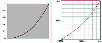
Gamma Curve and Dot Gain Curve
This chapter from “Real World Color Management,” co-written by creativepro.com contributing editor Bruce Fraser, lays the foundation on which to build you own color-managed workflow. You’ll learn in-depth the differences between how color appears on monitors and in print and find out why you need 256 levels of color. Even if you don’t plan to start using a spectrophotometer tomorrow, Photoshop users will pick up valuable tips.
We’ve posted this excerpt as a PDF file. Just click the link “Computers and Color” to open the PDF file in your Web browser. You can also download the PDF to your machine for later viewing.
To open the PDF, you’ll need Adobe Reader or Acrobat.
So your article on color provides photos with explanation, but they’re all in black & white…not too helpful.
Sorry about that — there was a technical glitch. All is well now and the pix that should be in color are in color.
Thanks for your patience,
Pamela Pfiffner, editor in chief