Adjusting Image Width in HTML
Creating a good HTML email is hard — and even harder when you want it to be responsive, so that it conforms to both desktop and mobile devices. Much has been written and taught on the subject (such as this course by Chris Converse), but we generally get around the whole issue by using a template-based system from an email provider (in our case, Mailchimp). These templates often work great for building responsive emails, but there’s one instance where it just doesn’t work that well: Placing images inside text blocks.
If you put an image in its own image block, or an image-and-caption block, it works fine. (Those are special types of sections set up by the email provider.) But if you try to insert a picture inside a text block, there’s a problem: the width of the image often causes the email to no longer be responsive… so it may look great on your desktop or laptop, but not when it shows up on a mobile device, like a phone.
For example, let’s look at a recent issue of our free CreativePro weekly newsletter… this is how it appears in the mobile preview mode in Mailchimp:

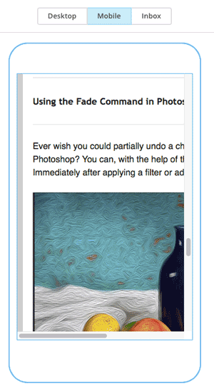
As you can see, it appears cut off… too wide! But of course, that’s just an emulation — Mailchimp is faking a mobile-size. Here’s how it looks on my iPhone:

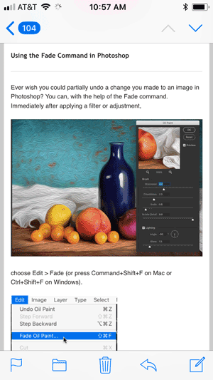
On the phone itself, the right side of the email doesn’t appear cut off (thank goodness!) but instead the text is scaled down considerably, so that it fits within the limited width of the mail client. That makes it difficult to read without pinching-and-zooming, or perhaps turning the phone sideways.
The problem lies within the HTML. In Mailchimp we can edit the text block and click the HTML button to view the code itself. Here’s how it looks:

While it’s a little messy, you can see that the image width shows up twice in this line — and in both cases, it’s set to 500 pixels. In a responsive world, we don’t want to think about specific pixel sizes if we can avoid it. Instead, it’s often better to work in percentages. So let’s change the width to a percentage of the column:

Now this image will be set to 80% of the column width. You’ll notice that I also added a max-width style, so the image won’t get enlarged if the email window is really wide — so in this case, the image can get smaller, but it will max out at 500 px wide.
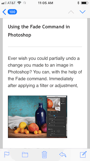
The result is exactly the same when the email is viewed on a desktop/laptop, but it’s considerably better when viewed on a phone:

I am certainly no HTML expert, and I’m sure I have a lot to learn about creating HTML emails, but this is one trick that I have found super helpful when formatting emails.

