

25 Type Tips

Reprinted from InDesign Magazine Issue 56: October/November 2013
Join InDesign Secrets Now and get InDesign Magazine!
InDesign is a type workhorse, giving you a wide range of options for automating, styling, and making type do your bidding. Whether you’re just getting started or you’re a seasoned pro, the options might seem overwhelming, or somehow be viewed as “cheating.” But with these tips you can put the power of type in your hands.
Working With Type Styles
It’s a fact of life: you simply cannot be efficient in InDesign without using paragraph and character styles. Learn them, use them, live them. And then, adopt these tips that will help you use them even better.
Keep Your Styles Simple
It’s a good idea to keep your character styles relatively simple. Remember, they are for the exceptions to the formatting you apply with your paragraph styles—for example, italic text to indicate emphasis of a particular word or sentence. So, when creating a character style, don’t specify font and style and size and color and so on (unless those are all important for the style). Instead, with no text selected, Option- or Alt-click the Create New Style button in the Character Styles panel, and then define the character style by choosing Italic in the Basic Character Formats pane. Not specifying a font in the character style (just leave that field blank) means that you can apply the same character style to body text and headings and it will still work. Also, remember: you should almost never apply a character style to an entire paragraph (that’s what paragraph styles are for).
Nest For Success
You can make InDesign automatically apply character styles to specific patterns of text by building nested styles into the definition of a paragraph style. For instance, if each paragraph needs to start with some bold type, then switch to italic, then back to the “regular” paragraph style settings, use nested styles.
The key to nested styles is telling InDesign where the change should occur. In the example in Figure 1, let’s say the italicized text sits within parentheses.
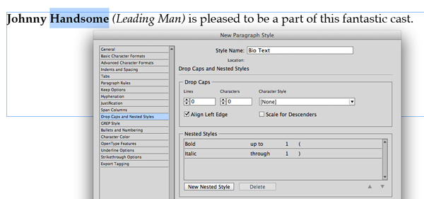
Figure 1: The key to nested styles is telling InDesign where the change should occur.
To “program” that, choose New Nested Style from the Drop Caps and Nested Styles pane of the Paragraph Style Options dialog box, and choose the bold character style from the drop-down menu. Next, indicate that this style is to be applied up to the first open parenthesis by choosing Up To from the drop-down menu and typing the open parenthesis in the last field. Next, create a second nested style (choosing your italic character style) that runs through the first closing parenthesis.
If the text doesn’t offer an obvious character to force the style change, consider using an en space or inserting the End Nested Style Here hidden character (Type > Insert Special Character > Other).
Fast Text Styling with Cell Styles
I see too many people assigning paragraph styles to text inside table cells manually. Instead of applying formatting to individual pieces of text in a table, you can automate the styling with a cell style. Click the Create New Style icon in the Cell Style panel, and choose the necessary paragraph style from the drop-down menu. Then, when you apply a cell style (or a table style that uses cell styles), all the text is formatted with the proper paragraph style automatically.
Create Highlights With Underlines
Take control over what underlined text looks like, and build your chosen styling into a paragraph style. If you simply choose Underline from the Character panel (or click the Underline button in the Control panel), you’ll just get the standard underline—the boring one built into the font. However, Option- or Alt-clicking the Underline button in the Control panel brings up more options (Figure 2)!
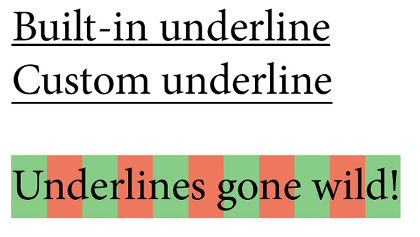
Figure 2: Take control over what underlined text looks like,
and build your chosen styling into a paragraph style.
You can choose the type of stroke, stroke weight, and amount of offset from the baseline. Additionally, you can choose a color other than that of the text, and set a tint and gap color, if you’re using a dashed or dotted stroke. For fun, try making a really thick stroke and a negative offset value to create a highlighting effect that will travel effortlessly with the text.
Working With Paragraphs
Paragraphs are, of course, the basic building blocks of most layouts. So of course you want to be able to make them be both effective and attractive. Not surprisingly, InDesign has ways to address many aspects of how paragraphs appear and behave.
Think Outside the Frame
Keep your paragraphs looking tidy by floating punctuation and serifs outside the text frame. With a text frame selected (or the text cursor inside a story), open the Story panel (Type > Story) and click the Optical Margin Alignment checkbox (Figure 3). To adjust how far into the margins the items will hang, adjust the point size in the box just below that checkbox. The default is 12 pt, but you can tweak the value and adjust the amount visually (in general, you should use the size of your body text). Since this setting is applied to the story, rather than to the text itself, it can be incorporated into an object style and applied to other text frames.

Figure 3: Keep your paragraphs looking tidy by floating punctuation and serifs.
Sometimes you’ll find a paragraph that just doesn’t look right with Optical Margin Alignment applied; fortunately, you can turn this feature off for selected paragraphs by choosing Ignore Optical Margin from the Paragraph panel (or Control panel) menu.
Splits and Spans
The ability to span a headline (or other text) across multiple columns in a multi-column text frame is an incredibly helpful feature when producing newsletters, magazines, newspapers, and other multi-column layouts. To take advantage of this feature, put your cursor in the paragraph in need of spanning, and then choose Span Columns from the Control panel menu (Figure 4). Choose Span Columns from the Paragraph Layout drop-down menu, and indicate how many columns the paragraph should span.

Figure 4: Choose Span Columns from the Paragraph Layout drop-down menu,
and indicate how many columns the paragraph should span.
You can even add space before or after the span, but remember: if you’ve also used the Space Before or Space After feature to add space before or after the paragraph, InDesign uses whichever value is greater. (That is, if you use 5 mm for Space Before and 3 mm for Space Before Span, InDesign will use 5 mm.) While Span Columns is cool, InDesign is also able to split a paragraph or multiple paragraphs—think short bursts of text, like a list of items—into “mini columns” within a column. Select the desired paragraphs, choose Span Columns from the Control panel menu, and then choose Split Column from the Paragraph Layout drop-down menu. You control how many sub-columns you want, the gutter between each, amount of space before and after, and any extra spacing on the outside of the new columns. Both Span Columns and Split Columns can be incorporated into paragraph styles.
Controlling Breaks
You can control how a word breaks—or doesn’t break—on a case-by-case basis. If you don’t want a word ever to break, select the word, and then choose No Break from the Control panel menu. You can apply this to more than one word to ensure they stay together—but be careful, as this sometimes results in text becoming “too wide” to fit in the frame (which then becomes overset).
There are at least two ways to control precisely how a word breaks. The “brute force” method is to place your text cursor in the word where you want the hyphen and choose Type > Insert Special Character > Hyphens and Dashes > Discretionary Hyphen. The “discretionary” refers to the fact that the hyphen is there if necessary (if the word is near the end of the line), but never shows up mid-line if your text reflows. You can also use InDesign’s Dictionary feature to customize how the program adds hyphens to words (see this article at InDesignSecrets).
Keep Options
Orphans and widows are lonely lines of text at the top or bottom of a column or page. You can (and should!) eliminate them by using the Keep Options features (Figure 5). (You can find Keep Options in the Control panel menu or when editing the definition of a paragraph style.) The section labeled Keep Lines Together gives you the option of never allowing a paragraph to break across pages or columns: choose All Lines in Paragraph. The next option, At Start/End of Paragraph, lets you dictate how many lines must appear in each location. By specifying 2 lines at the start and 2 at the end, you’ll be sure to never see a widow or orphan again.
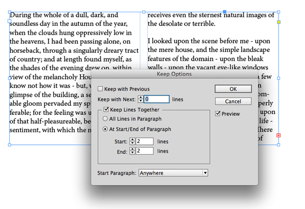
Figure 5: You can eliminate orphans and widows by using the Keep Options features.
There are other great features in this dialog box, too. Select the top option, Keep with Previous, to make sure the specified number of lines of the previous paragraph stay with the selected paragraph. This option is perfect for keeping headlines together with the paragraphs they introduce. The bottommost option, Start Paragraph, lets you force a paragraph to start at the next column, frame, or page. All of the Keep Options can be built into a paragraph style.
Working With Text Frames
As powerful as styles are, they don’t control every aspect of text formatting. Text frames also have attributes you can use to efficiently build your layouts and control the look of the text they contain.
Automatically Add Columns
Everyone knows you can set a text frame to contain more than one column in the Text Frame Options dialog box (which you can find in the Object menu). But few people realize that you can specify a flexible number of columns in a text frame, rather than choosing a set number. Change the Columns option inside this dialog box from Fixed Number to Fixed Width, and then choose the width that
you want each column to be. The next time you resize the text frame, InDesign adds (or removes) columns as necessary.
If you’re not picky about how wide the column should be, choose Flexible Width from the Columns drop-down menu, and then indicate the maximum width allowed in a single column. This tells InDesign to allow some flexibility in the column width, but still constrains it so that the column will never get too large.
Auto-Size
Overset text frames have long been one of the most frustrating problems in InDesign. Fortunately, there’s a cure: the Auto-Size feature, found in the Text Frame Options dialog box. Select a text frame, choose the Auto-Size tab inside that dialog box, and indicate how the frame should resize: by height, width, both, or both while keeping the original proportions intact. The strange-looking grid lets you choose in which direction
the change should take place. As you insert or remove type, the text frame grows or shrinks to accommodate the text. Other options include a minimum height and width, and whether or not
line breaks are allowed.
Kerning, Tracking, and Fonts
Most of the tips we’ve talked about so far approach text on a pretty macro level: working with pages, paragraphs, and text frames. All of which is, of course, very important. But now it’s time to zoom in a little closer, and look at functions you can use to affect individual text characters.
Kerning
Controlling the spacing between pairs of letters—known as kerning—is handled through the Kerning field in the Character or Control panel (Figure 6). Choosing the default Metrics setting from the menu next to the field tells InDesign to use the kerning built into the chosen font. For precision control, place your cursor between the two letters you’d like to manually kern, and input a specific value in the field. Alternately, you can press Option/Alt-Left/Right Arrow to decrease or increase the kerning by an amount specified in the Preferences dialog box.

Figure 6: Controlling the spacing between pairs of letters is handled
through the Kerning field in the Character or Control panel.
Choosing Optical from the kerning drop-down menu tells InDesign to adjust the kerning automatically, based on the letter shapes. You may want to use optical kerning when mixing fonts on the same line, using fonts of varying sizes or weights, or when a font contains little or no built-in kerning.
Here’s a fun trick to help you evaluate kerning objectively: rotate your text frame or page view 180°. This way, you can judge how letters look next to each othe
r without being distracted by actually reading the words.
Tracking
Controlling the amount of spacing on an entire block of text—called tracking or sometimes “range kerning”—is also handled in the Character panel (or character section of the Control panel). Select all the text you want to affect, and then choose a tracking amount, or use the same shortcut as for kerning: Option/Alt-Left/Right Arrow. (When the cursor is flashing between two letters, the shortcut changes kerning; when more than one character is selected, it changes tracking.) You can apply tracking on top of kerning, and the effect is cumulative; the relative amount of kerning remains as you increase or decrease overall tracking. Here’s another cool shortcut you should know: You can add or remove word spacing (the amount of space just between words) without affecting the space between the letters inside the words. Select two or more words, and then press Shift-Option-Command- or Shift-Alt-Ctrl- to add space between the chosen words. Shift-Option-Command-Delete or Shift-Alt-Ctrl-Backspace decreases the spacing.
Recent and Favorite Fonts
Fonts are wonderful, but they can also be a distraction, especially when you have too many of them. Fortunately, InDesign CS6 introduced a new feature that automatically places the most recently-used fonts at the top of all the font menus. This is super helpful when trying to find a font you used recently but can’t recall the name of (Figure 7).

Figure 7: InDesign CS6 introduced a new feature that automatically places
the most recently-used fonts at the top of all the font menus.
Then InDesign CC took it even further, with the ability to filter fonts by name quickly and designate fonts as “favorites.” It’s worth taking the time to choose some faves, so you can find them faster later. Each font has a star next to its name in the menu; simply click the star to favorite it. You then have the option to display only your favorite fonts in the menu.
Additionally, you can start typing a portion of a font’s name in the font field—in either the Character or Control panel—and only those fonts whose names contain that text will appear. This feature isn’t so handy if you search on the term “bold,” but if you remember the font contains something more specific, like the word “ornaments,” it can be a real time-saver.
Scripts For Working With Text
Most graphic artists I know don’t think twice about spending an hour or two playing with and checking the formatting of type in a project—of course it’s worth the time to get it just right. Sometimes that makes the most sense: a unique process for a unique outcome. But whenever possible, you should work smarter, not harder, and take advantage of the many excellent scripts out there that can make some text formatting tasks much, much easier.
Wordalizer
Want to give your audience a fun visual? Try a word cloud, using the Wordalizer script from Indiscripts (Figure 8). The free version of the script lets you choose from a set of themes, ignore the most common words, control the angle of the words, and set the maximum size and kerning amount in the final display. There is a paid version that adds the ability to edit the importance—or weight—of each word
in the resulting design.
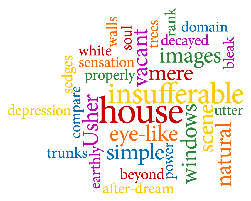
Figure 8: Try a word cloud, using the Wordalizer script from Indiscripts.
Scribbler
Put a little jiggle in your words by using the fun Scribbler script (Figure 9). The free script from Loïc Aigon moves your type slightly above or below the baseline, giving it a jumbled appearance. While I wouldn’t recommend it for large swaths of prose, it can add a little whimsy to text—in a children’s book, for instance.
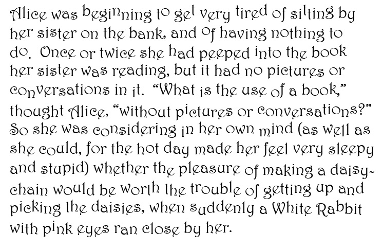
Figure 9: Put a little jiggle in your words by using the fun Scribbler script.
ShowHideLocalFormatting
On a more practical note, the ShowHideLocalFormatting.jsx script from Indiscripts lets you see exactly where someone has applied style overrides (text formatting over and above the paragraph or character styles). Simply double-click the script to view the overrides. Character style overrides are indicated with a red strikethrough, while paragraph style overrides are marked by a vertical red line to the left of the paragraph. Now that you see the overrides, it’s up to you to fix them. If only there was a script for that, as well!
It Takes An Eye
As designers, we sometimes shy away from anything that automates our tasks for us or makes our jobs seemingly routine. But by blending our designer’s eye with InDesign’s automation and type-taming features, our type and our designs will really shine.
***
Erica Gamet has been involved in graphics and prepress for over 25 years. She is a speaker, writer, and trainer focusing on Adobe InDesign, Apple Keynote and iBooks Author and other print- and production-related topics. When she’s not keeping students from their Angry Birds games, Erica can be found propelling herself around Colorado on two wheels or watching campy British sci-fi.
Thanks for a great list of suggestions — both refreshers AND new info for me.
While I applaud your tips on using type features within InDesign, the typesetting in the samples is not of the highest quality. Instead of space-hyphen-space for emphasis, use an em dash. For example: “…upon opium—the bitter lapse of everyday life—the hideous dropping off…” instead of “…upon opium – the bitter lapse of everyday life – the hideous dropping off….” Also, basic knowledge of using only one space after periods and colons should be observed.
Yes, those are unacceptable practices. They were overlooked in the screenshots because they weren’t the focus of the examples. And often screenshots simply represent work in progress.
Nice post.
You can actually easily clear overrides in formatting by executing a Find/Change. You have to search for a specific style and replace it with the same style
anybody here still got the scribbler script? seems like site is down. please contact me [email protected]
Seems like it’s working for me: https://www.softpedia.com/get/Multimedia/Graphic/Graphic-Plugins/InDesign-Scribbler.shtml
Is it not working for you?